
LUTs & LUMIX ‘Looks’
I’ve been using LUTs to colour my videos for years, but now that I can load LUTs directly into my LUMIX camera to shoot JPEGs, I thought it was time I started designing my own. As well as designing and loading in LUTs, recently I have been adjusting in-camera settings and creating what I have coined as LUMIX ‘looks’.
I’d really appreciate a shout out on Instagram or YouTube if you try these LUTs or ‘looks’ for yourself and if you like them, why not come back and drop a little something in the Tip Jar.

Porcelain Portra
Porcelain Portra is a warm, sharp, film-like ‘look’ designed for portraits. Just like film, feed it lots of light and it will thank you. Think Kodak Portra, but a digital version…

Kodapop 500S
A warm, bold, bright and summery ‘look’ based on the very first LUT I ever created, Summer. This one reminds me of cheap Kodak film, it’s grainy and captures images that are sure to POP!
Imperial Ultra 200
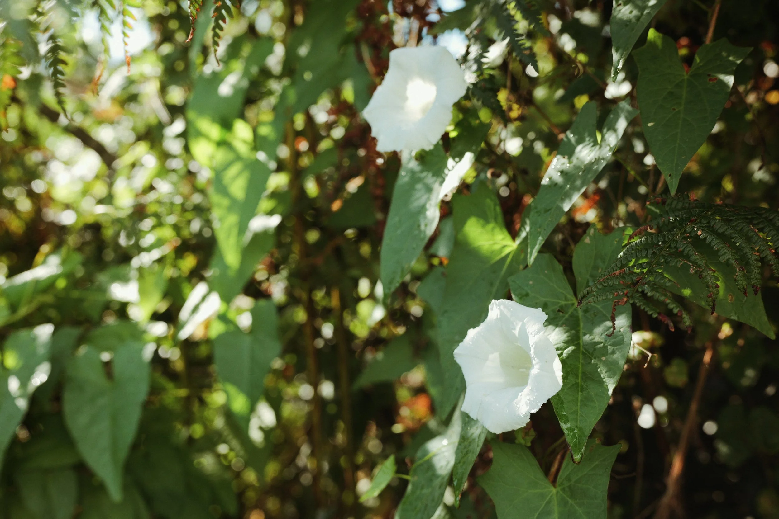
This new ‘look’ combines Daisy & Ontario with an WB shift to capture JPEGs that are soft and warm, with overall minty green hue. It’s flexible, versatile and full of personality…

Lucky Color 200
If you are offended by strong, vibrant, bold, popping colours, maybe skip this one. But if you’re excited by a ‘look’ that’s a little more ‘out-there’… my Lucky Color 200 is for you!

Portramax 400
I had a hunch that combining Mara & Daisy would do something special, and I wasn’t disappointed. Introducing Portramax 400, an all-round, film-like ‘look’ for shooting LUMIX JPEGs…
Fujifilm Pro 400H
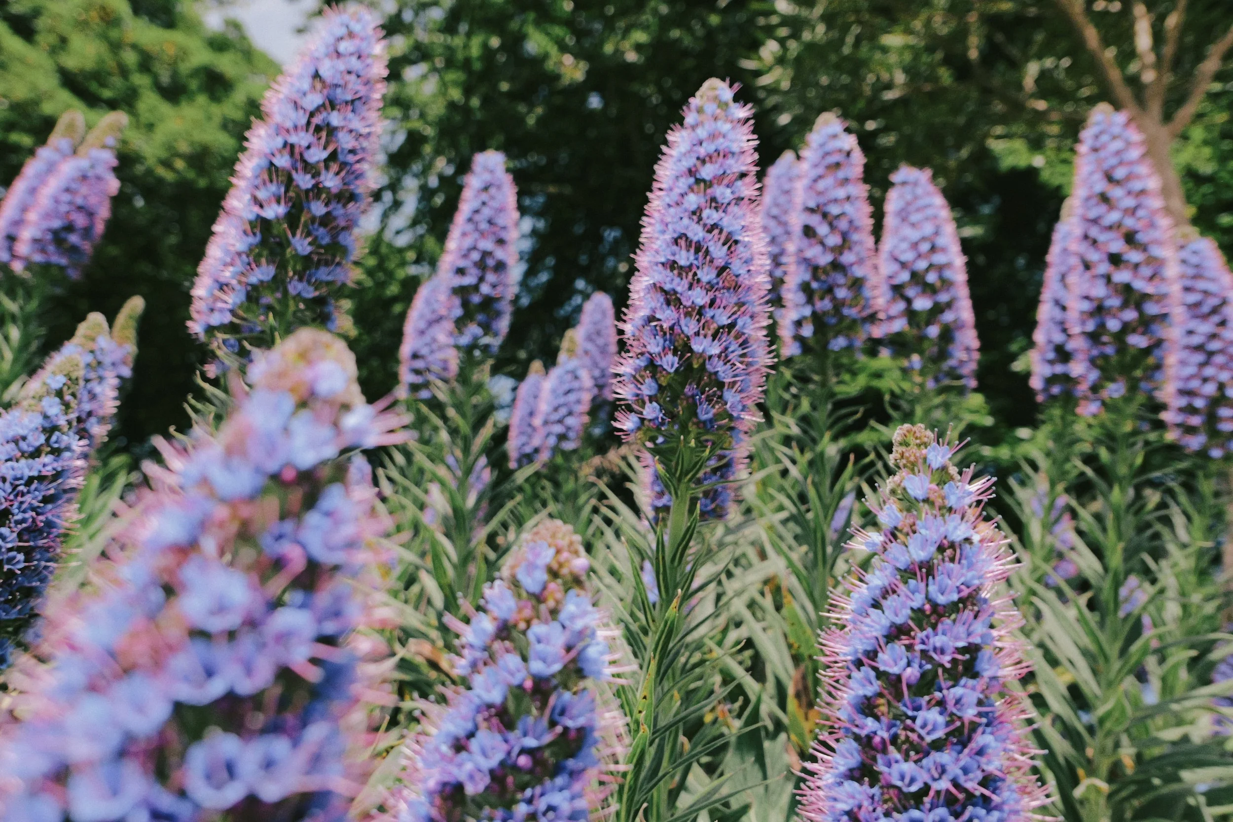
Fujifilm Pro 400H is an iconic film stock, known for its soft and pastel colour palette with an emphasis on greens and magentas. Check out my LUMIX version here…

Lomography Color Negative 100
Lomography Color Negative 100 is a film stock that’s super punchy and super vibrant so if you aren’t afraid of colour this one is definitely for you!

Neocross R100
Neocros R100 has become by absolute go-to black and white ‘look’. It’s deep, sharp, flexible and I think has a really beautiful tone…


Ektamax Éire 100
A bright, warm, saturated ‘look’ with a lovely overall pastel Kodak palette. Will work in a wide range of situations but is perfect for anything with bold bright colours…

Kodak Gold 200
Kodak Gold 200 is one of Kodak’s cheapest film stocks, which means it is one of their most used, well-loved and well-known too… so I wanted to get this ‘look’ right!

London Superia 200H
London Superia 200H is reminiscent of some classic Fujicolor film stocks. It’s a subtle, flexible ‘look’ with a focus on greens/magentas but still has a nice warmth for balance…

Malin Gold 50N
Sitting somewhere between Kodak’s Gold 200 & 50D is Malin Gold 50N. If you’re looking for a flexible, subtle and warm ‘look’ for your JPEGs give this one try…

Alfama 250B
This is the first of my subtle, flexible, every-day ‘looks’. Expect warm, brown, Kodak-like tones in your LUMIX images shot with Alfama 250B…

CineStill 400D
This LUMIX ‘look’ has been inspired by one of my favourite film stocks . The unique, dynamic, complicated but beautiful CineStill 400D. Check it out…

CineStill 50D
I’m really pleased with this new CineStill 50D ‘look’.. I love the muted colours and soft contrast of this film stock and having a LUMIX ‘look’ that matches that, is a lot of fun to shoot with…

LomoChrome Color ‘92
A couple of years ago Lomography released LomoChrome Color ’92 and being born in 1992 myself, I was instantly intrigued. Check out my LUMIX ‘look’ inspired by this film stock here…

Kodacolor 200
No matter what you call it (Kodacolor 200 or ColorPlus), I absolutely love the look of this film. It’s punchy, vibrant, warm and great for everyday use…
Enjoying my content?
Why not drop something in the Tip Jar below to say thanks.
It would be massively appreciated!