Porcelain Portra
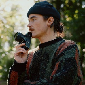
I’m stoked to be sharing this new LUMIX ‘look’ with you all, actually it’s more of a relief to get it off my chest and out into the world. Some LUMIX ‘looks’ come easy and practically design themselves (they don’t but you know what I mean) this one on the other hand was truly a struggle! But luckily I kept going with it and knew that if I put in the work… magic would come out the other side. This is Porcelain Portra - a warm, bright, sharp, film-like ‘look’ specifically designed for shooting portraits. Check out some example images I shot with Ruth below and read on to learn about how I designed the ‘look’…
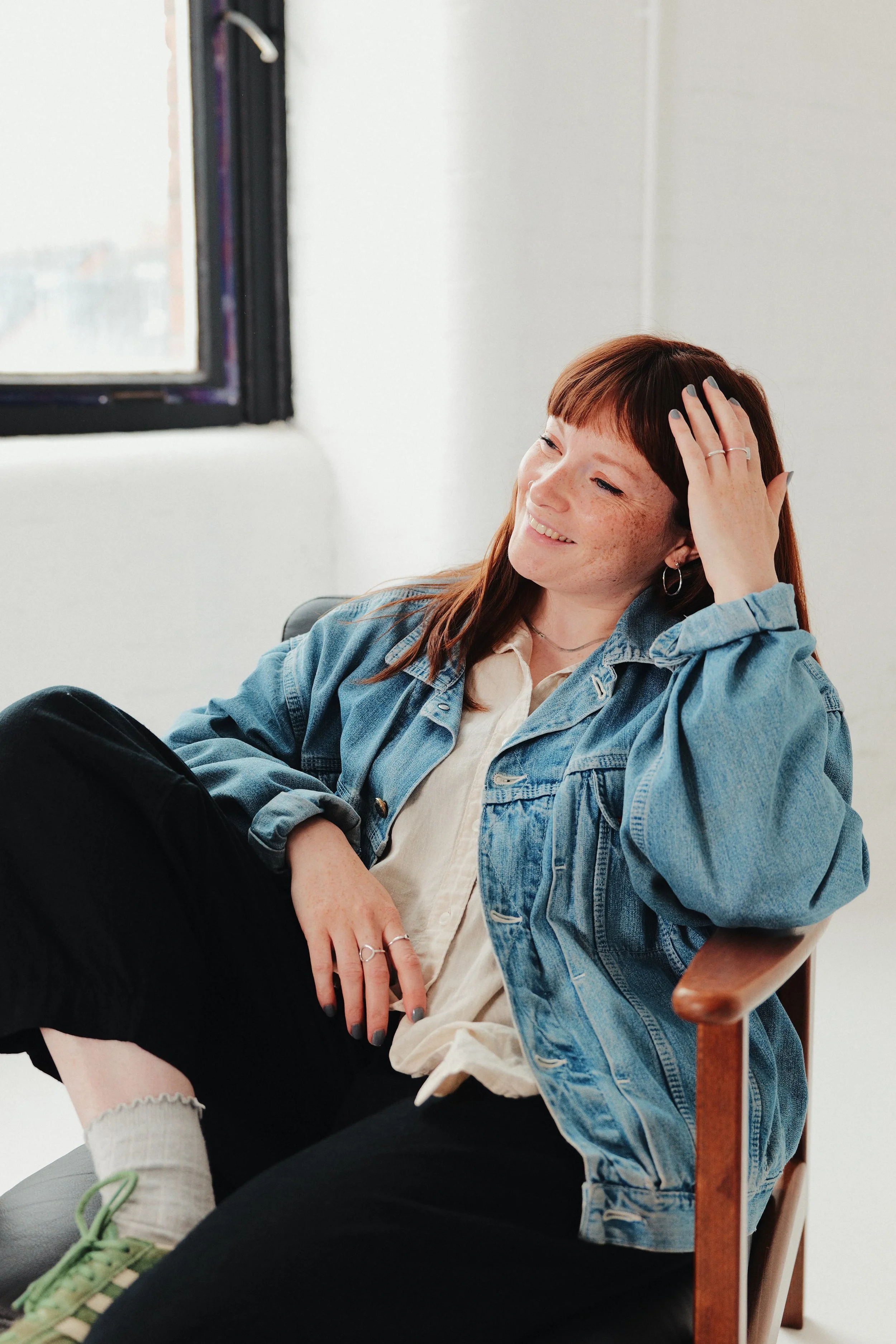
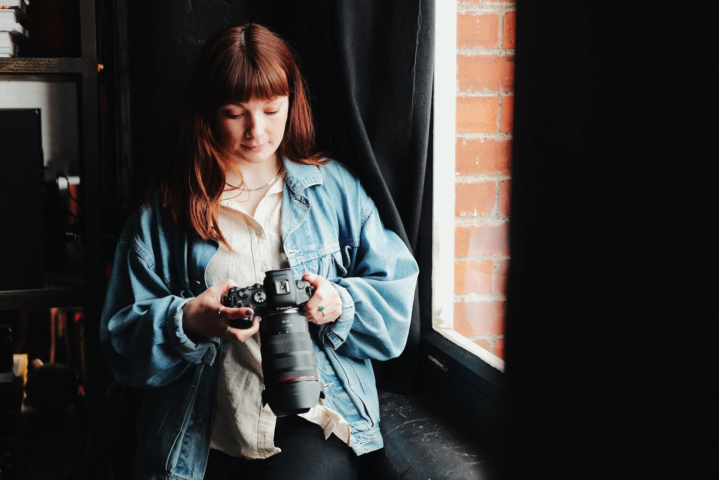
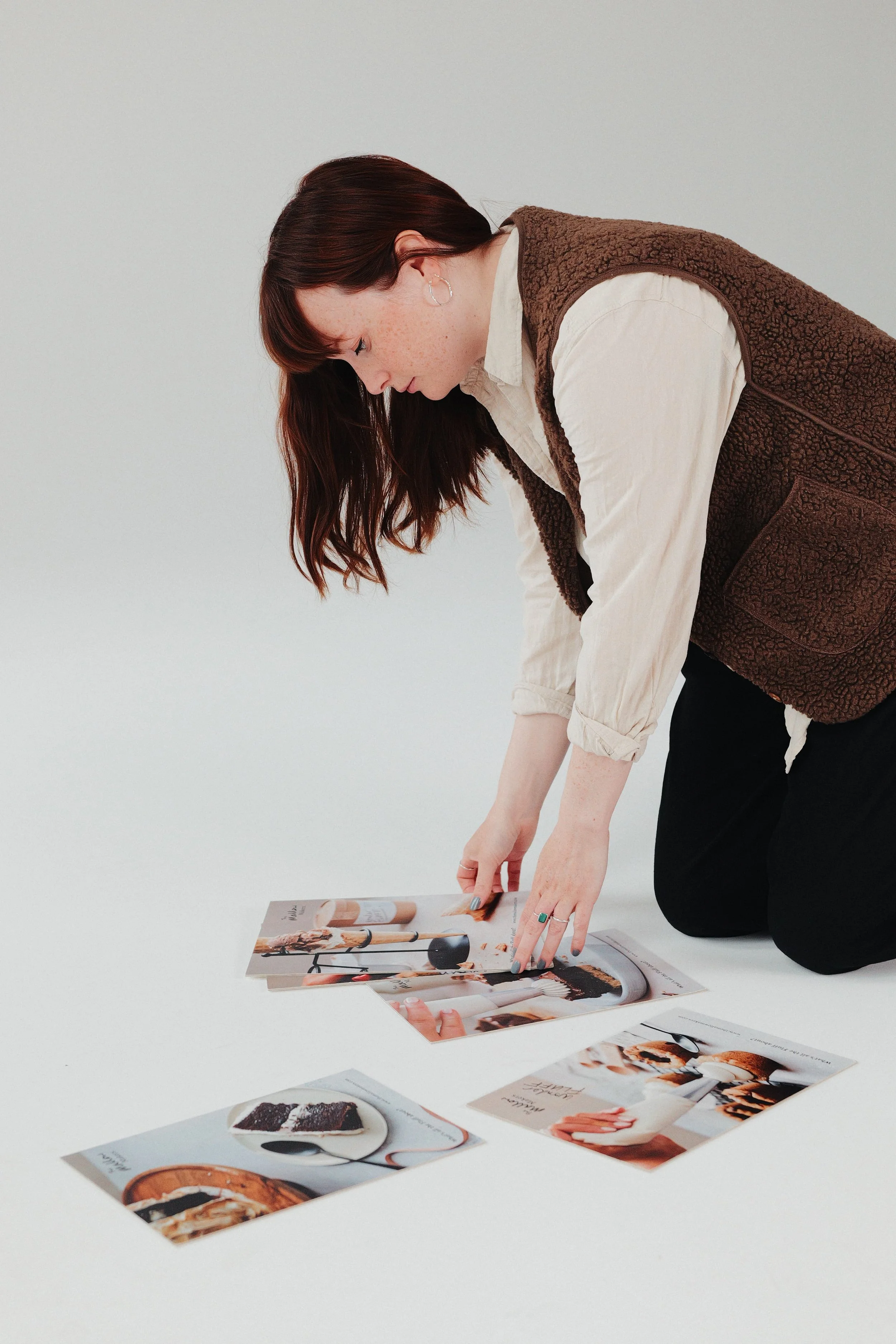
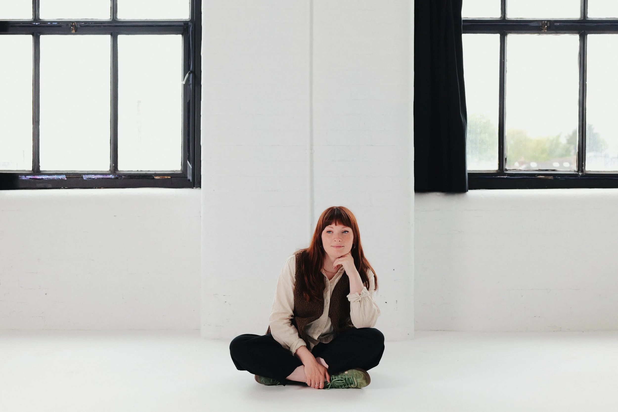
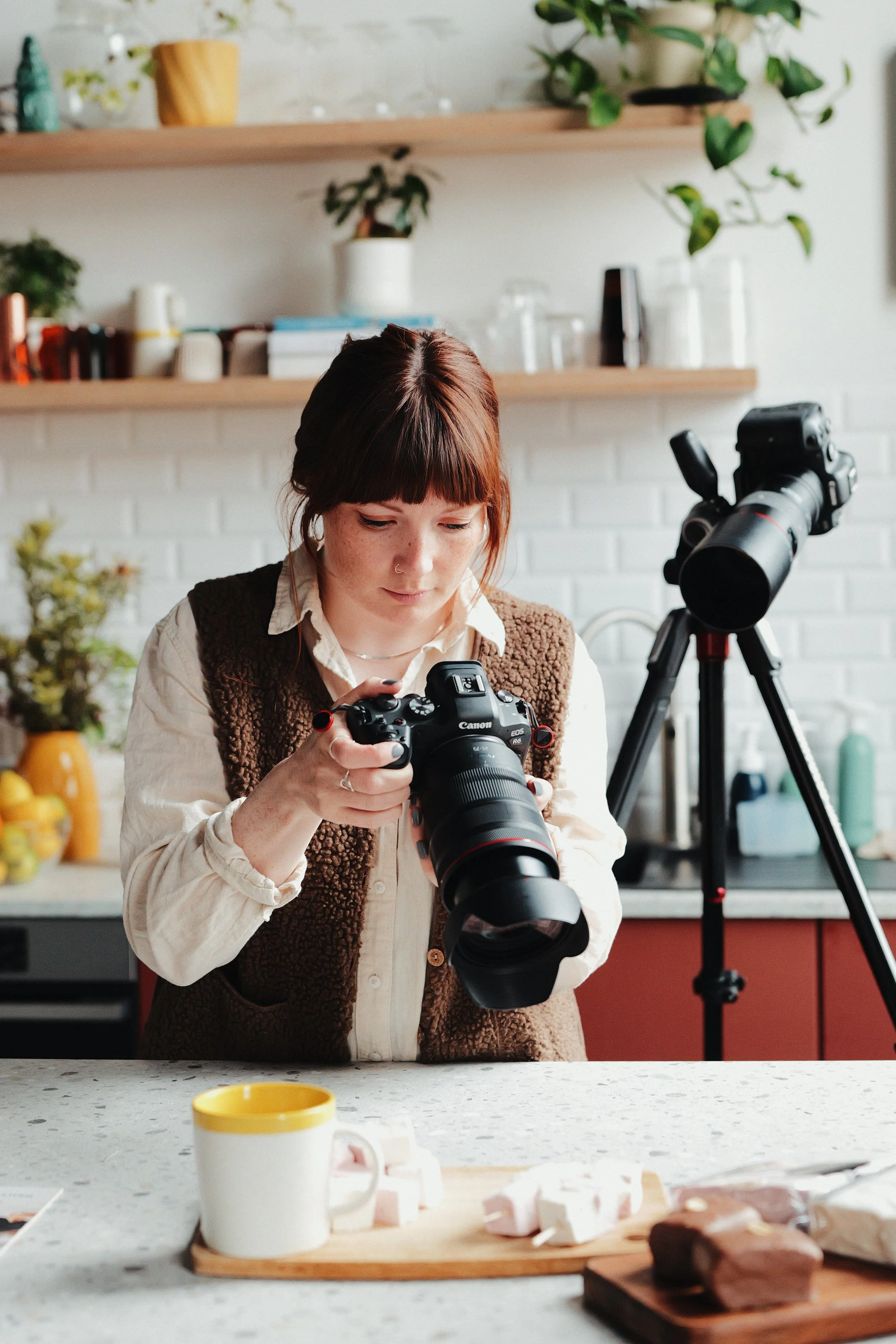
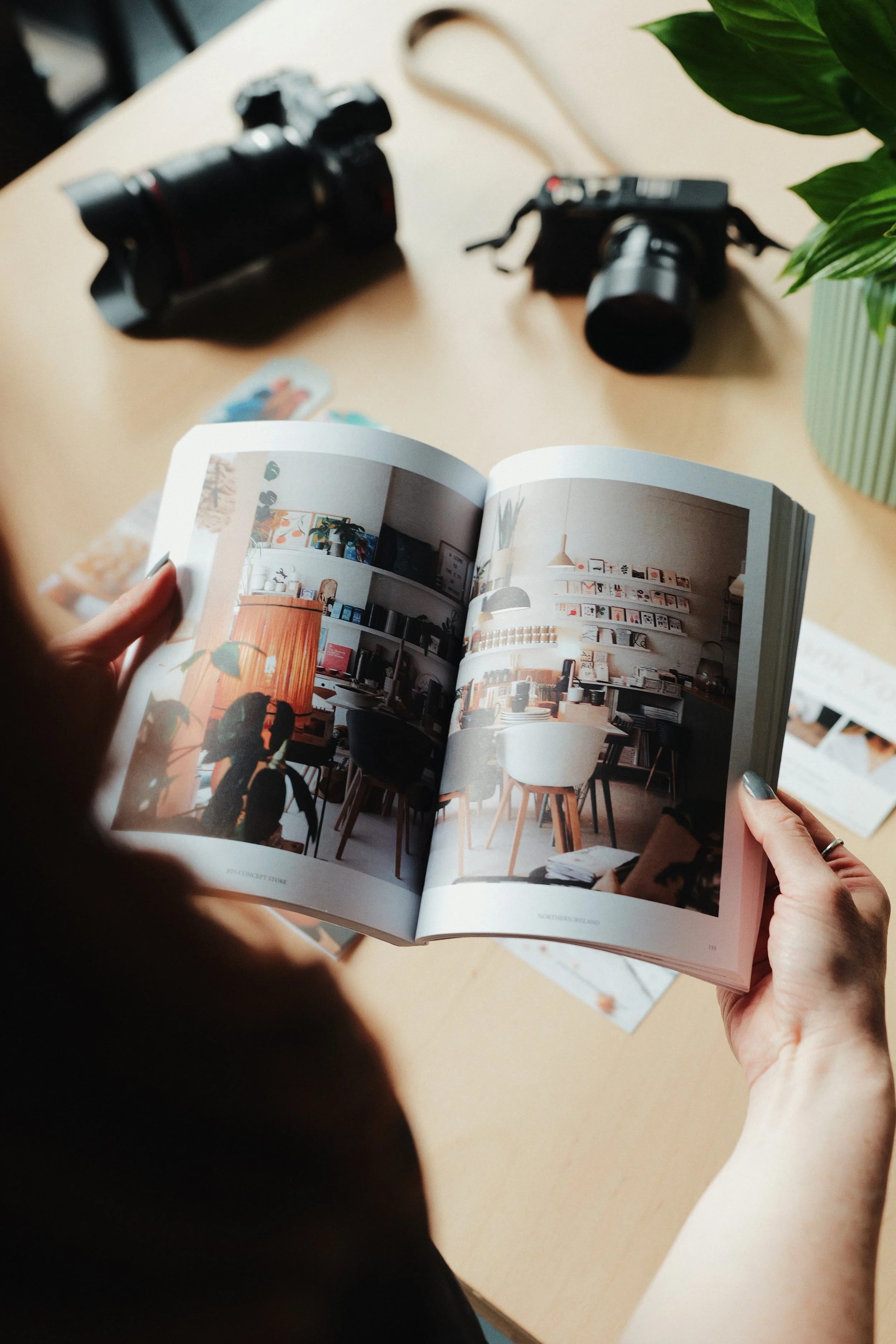

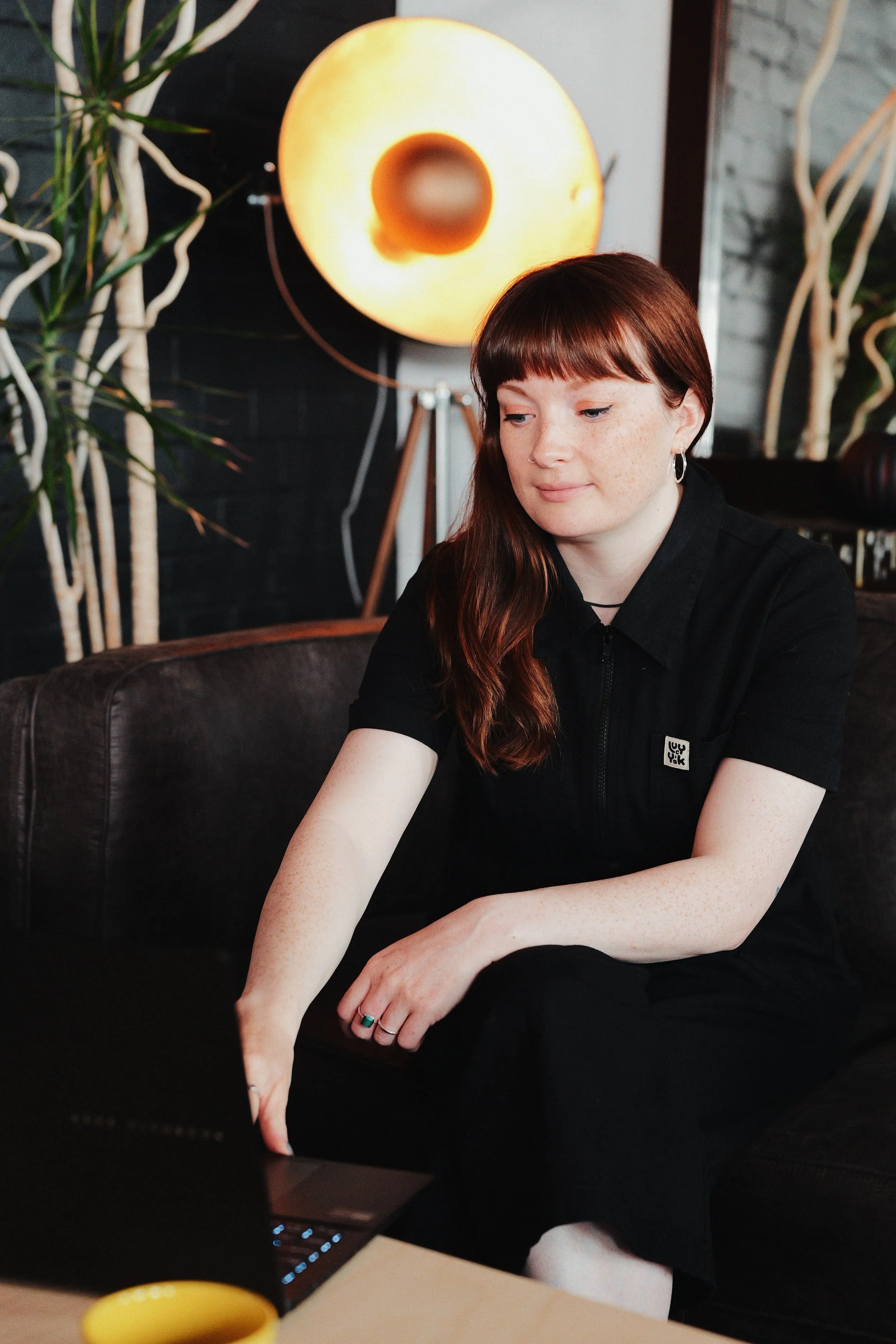
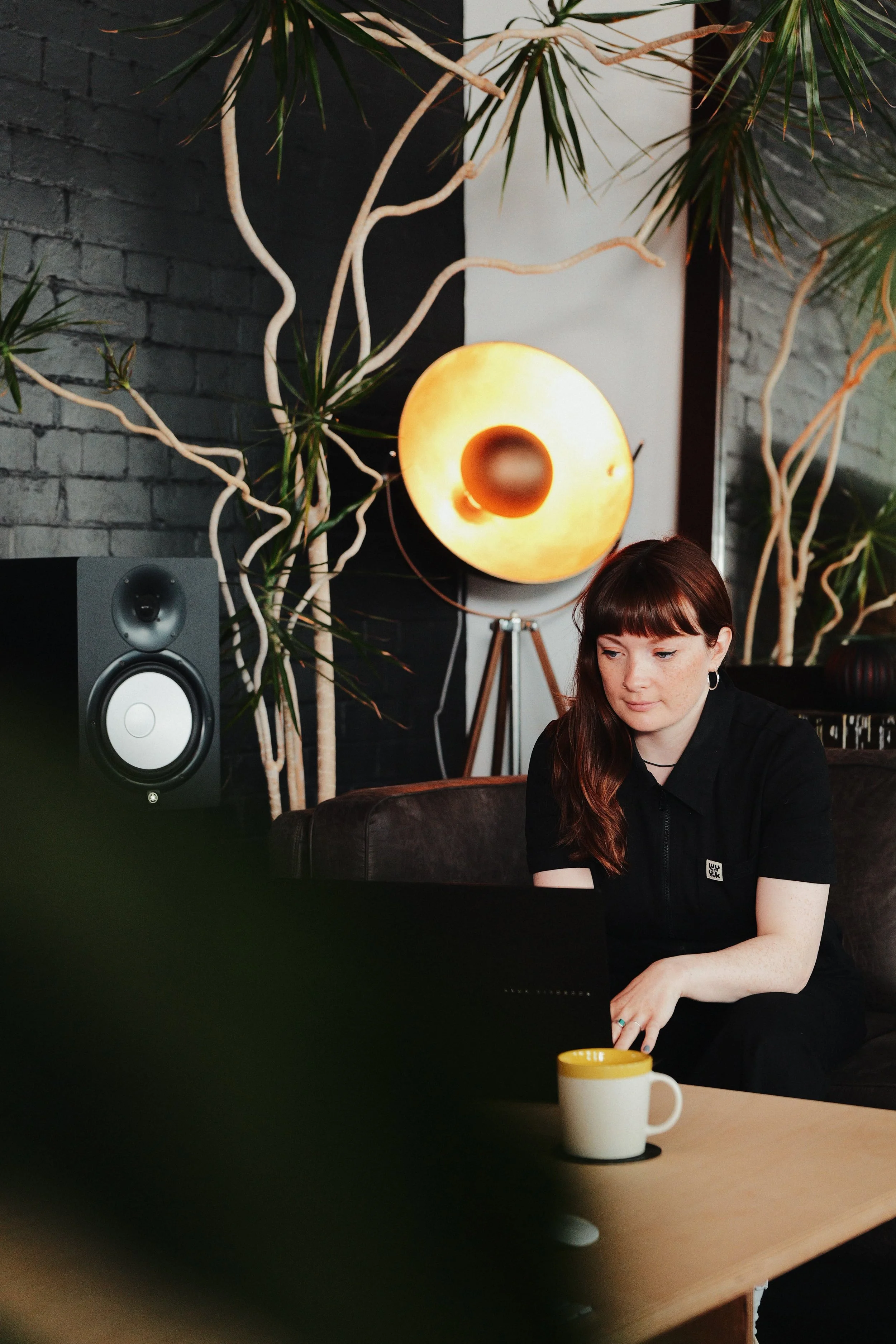
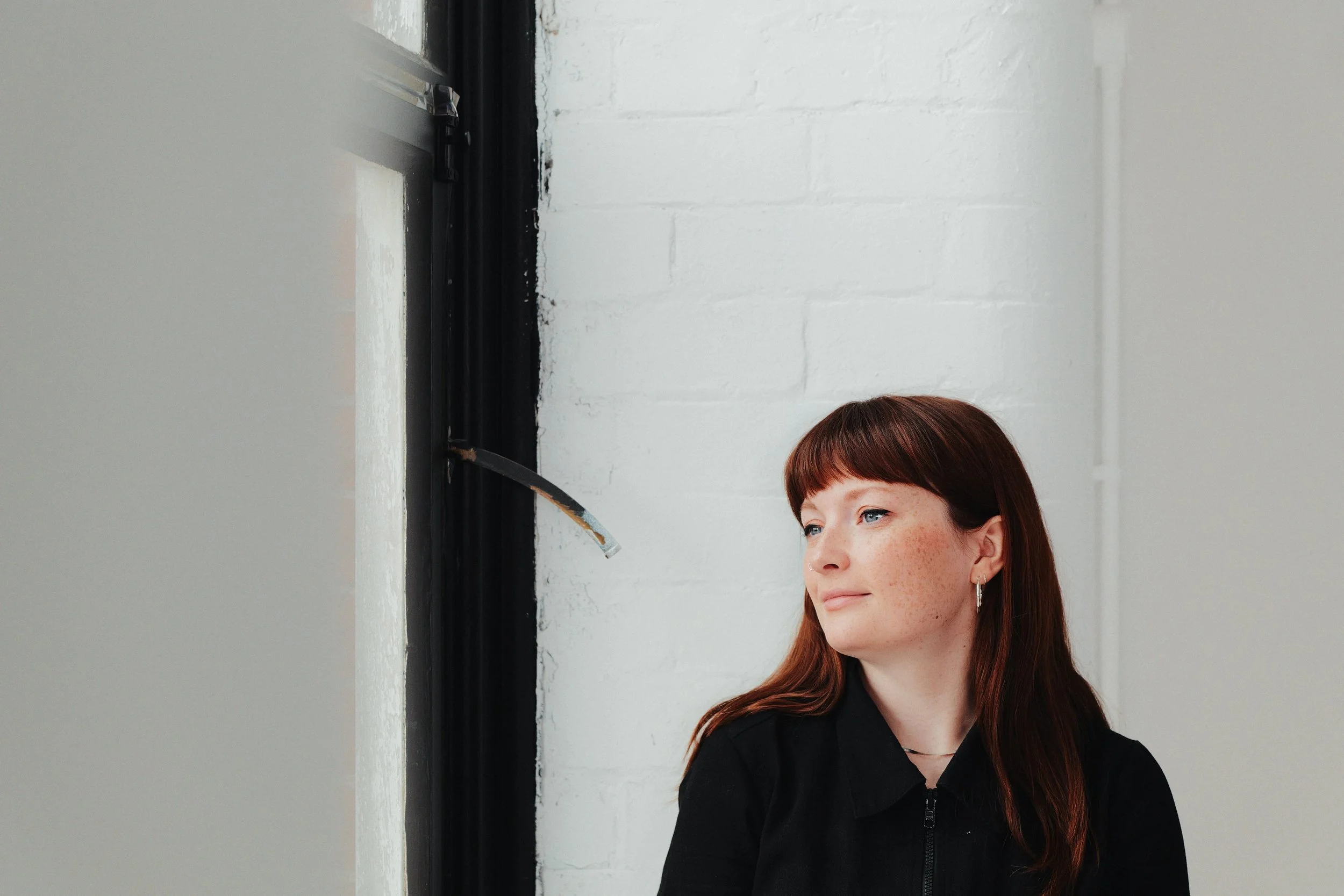
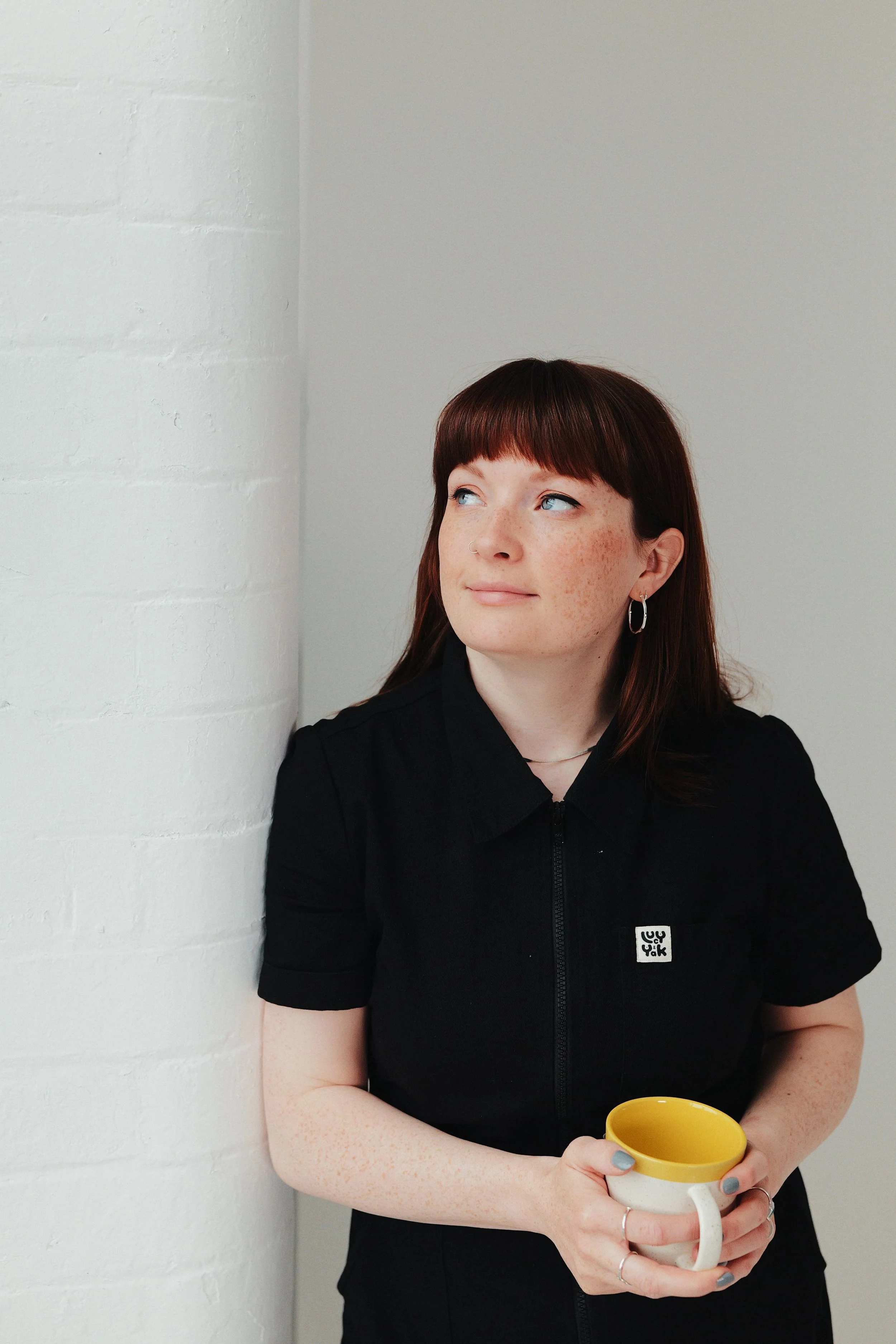
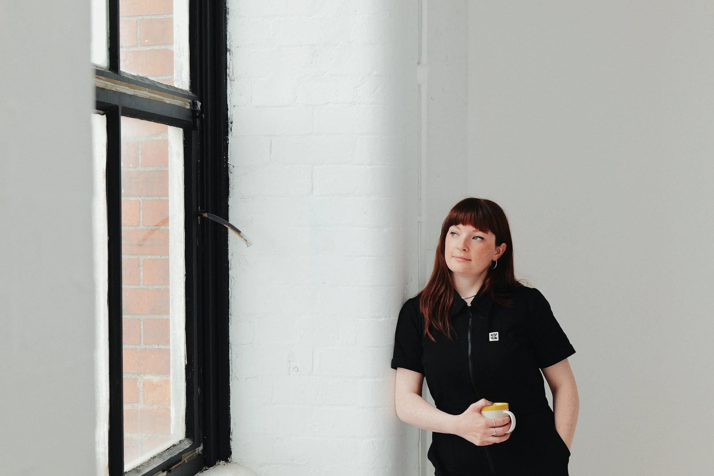
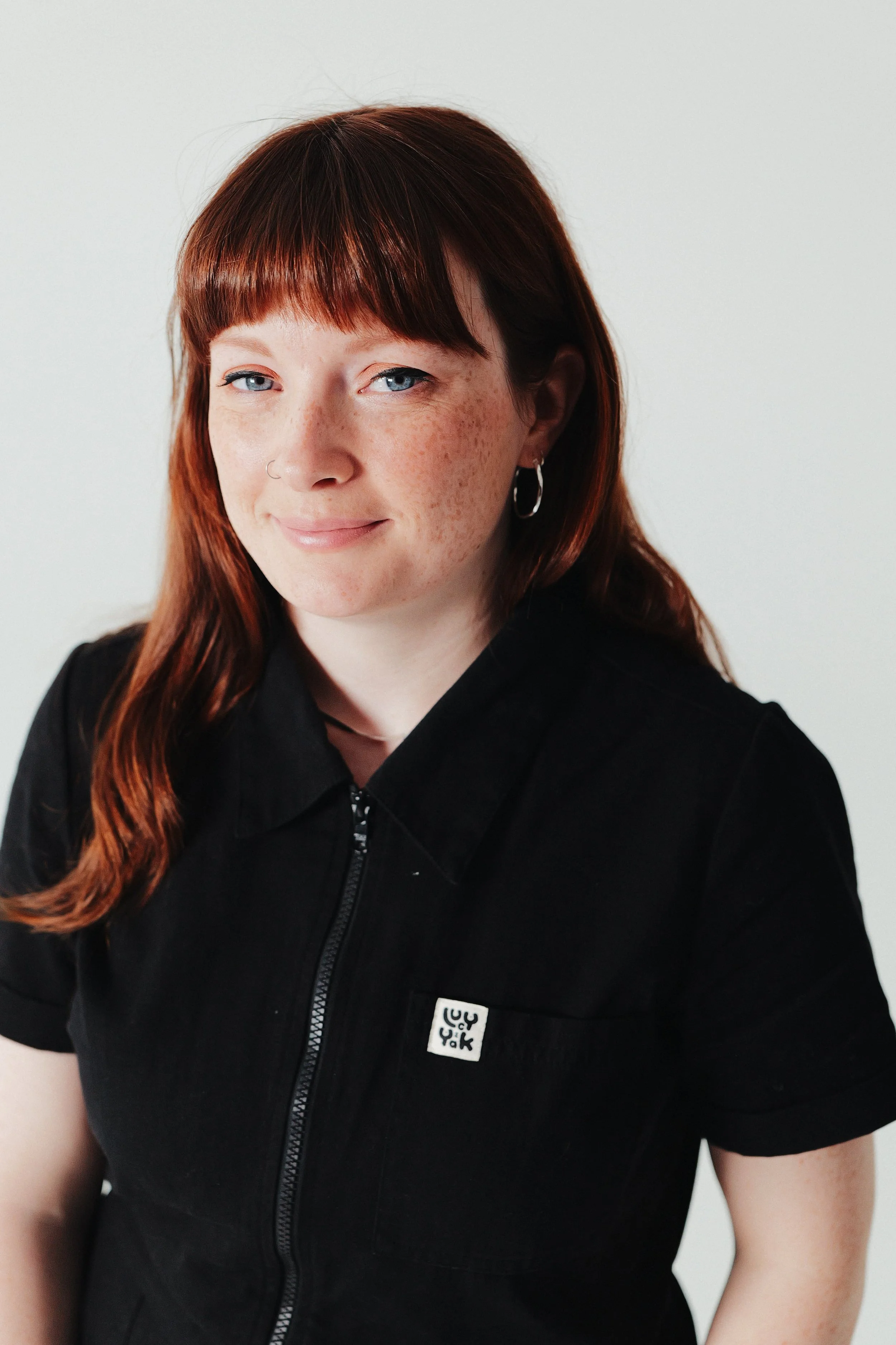
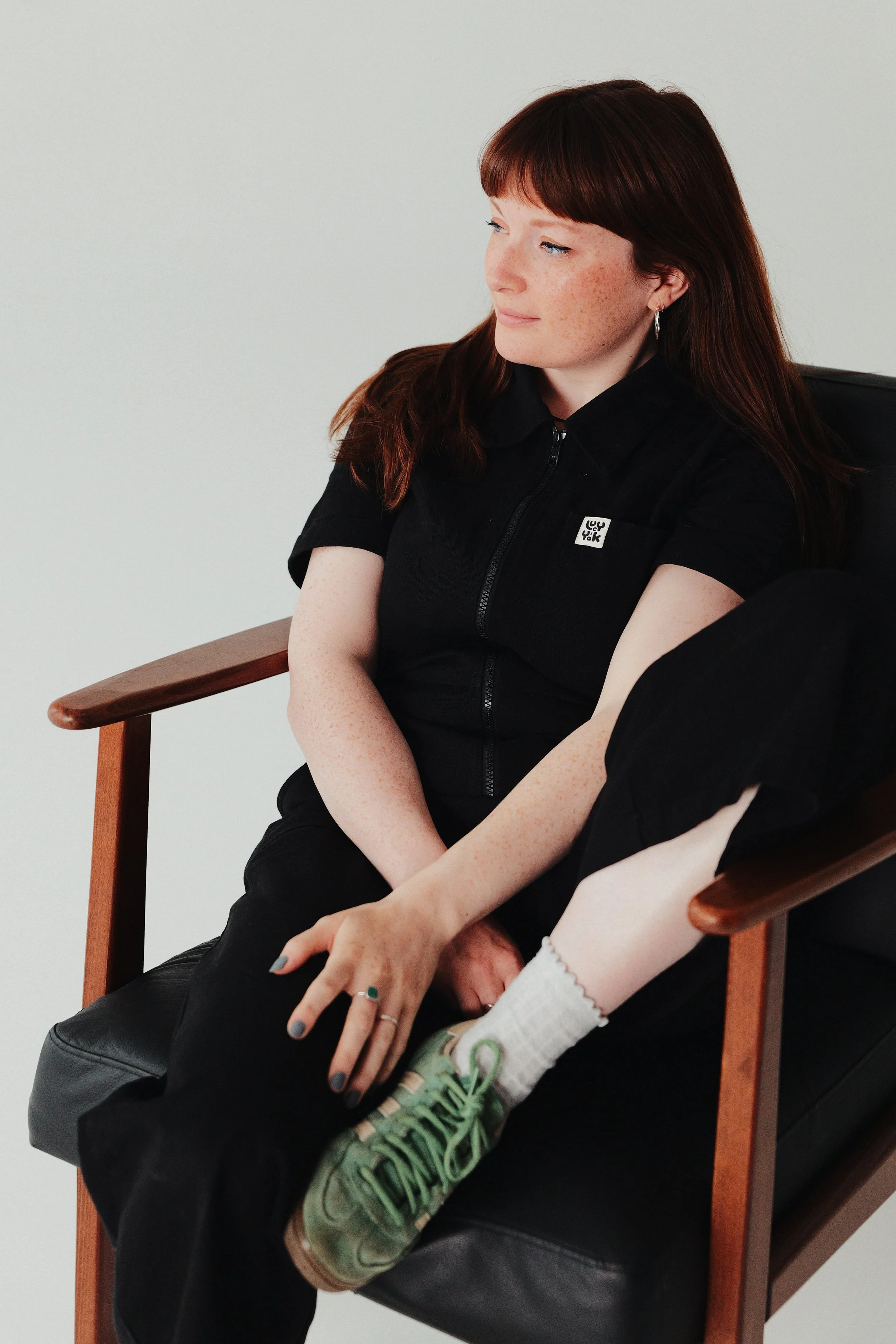
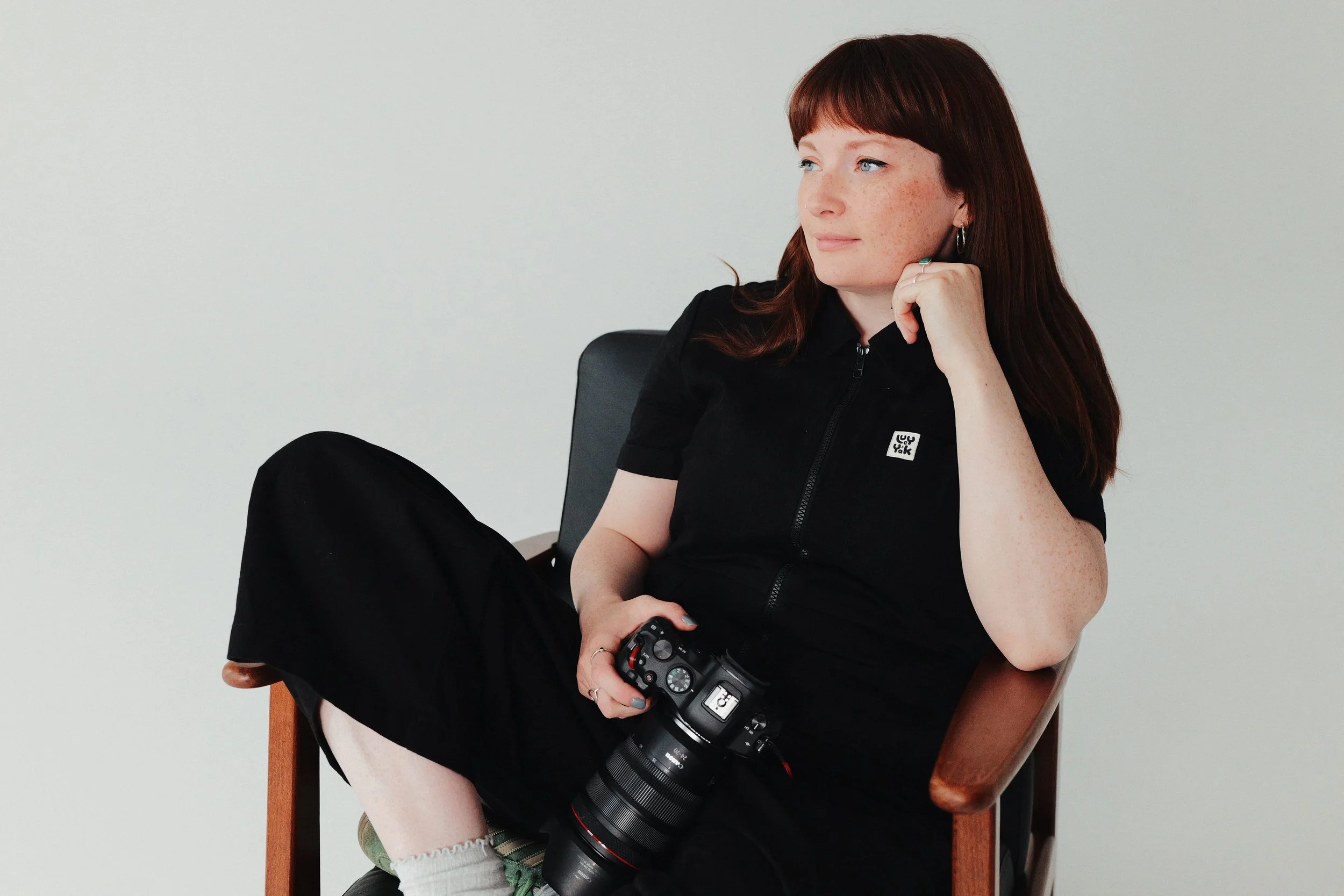
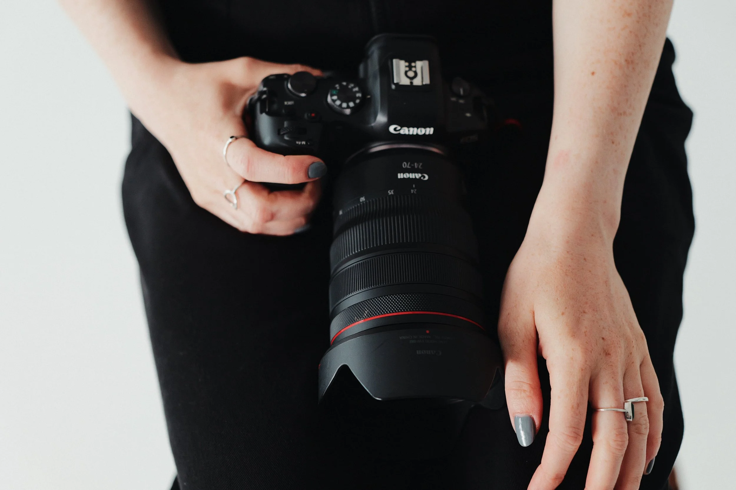
Earlier in the year I released two LUTs inspired by Kodak Portra 400 (Maku & Mara). My starting point for this whole ‘look’ was Mara. It’s probably my favourite LUT I’ve ever made. Something I wanted to do though is create a ‘look’ that used most of Mara but had another unique tone to it, a warmth underneath. After combining Mara with a previous LUT Bonboa, I knew I was on to something good.
It took a while to work out how to combine these two LUTs but I landed on LUT Opacity settings of Mara @70% and Bonboa @30%. Colours aside, Mara has quite a strong impact on the tone of the highlight and Bonboa is the opposite affecting the shadows. This combination of 70/30% felt right and I’m really please the results combining these two LUTs.
You can download both of these LUTs below…
After I had combined Mara & Bonboa, the next step was to nail down the tone settings inside my LUMIX camera. When shooting JPEGs I’ll usually play around with my i.Dynamic Range setting, however as this ‘look’ would be mainly designed for shooting portraits, I knew I wanted to leave my i.Dynamic Range setting OFF to protect the RAW files. (If you didn’t already know the i.Dynamic Range setting is just about the only setting that will directly affect your RAW files. Turning up i.Dynamic Range will literally darken the RAWs.)
As Porcelain Portra was being designed for skin, I wanted to soften the mid-tone contrast by setting my Contrast to -4. In my test shots, I found that with this Contrast setting, my two LUTs, and the Natural Photo Style my highlights were quite protected so I could overexpose my images without them looking crazy blown out and to balance this out I could set my Shadow setting to -4 to bring the shadows back down again. It might seem a little complicated (maybe I was overthinking the settings on this one) but I’m really happy with the results I can get with this ‘look’ so something worked.
To finish off the ‘look’ I set my Grain setting to LOW to match the fine grain found in Kodak’s Portra film stocks, Sharpness set to 0 and finally I set my White Balance to AWB with a slight amber push of A:2 to bring a final bit of warmth. As I mentioned above, I tested, retested, and tested this ‘look’ again and again, but when I finally landed on these settings (see below) I was blown away at the quality of the JPEGs I got straight out of my camera. They’re definitely the closest I’ve got to a digital version of Portra so far.
If you’re on the hunt for a warm, bright, sharp, film-like JPEG ‘look’ for shooting portraits… maybe your hunt is over. Let me know what you think if you end up using this one for your own photography. I’ve been loving it, I hope you will too!
Porcelain Portra
[by rossandhisjpegs]
Photo Style: Natural
Contrast: -4
Highlights: 0
Shadows: -4
Saturation: 0
Hue: 0
Grain: LOW
Color Noise: OFF
Sharpness: 0
NR: -5
i.Dynamic Range: OFF
White Balance: AWB (A:2)
LUT 1: Mara by rossandhisjpegs
LUT 1 Opacity: 70%
LUT 2: Bonboa by rossandhisjpegs
LUT 2 Opacity: 30%
(Remeber to overexpose a little with this ‘look’. Trust me!)
Check out more about this ‘look’ in this video…
If you enjoyed this post, why not drop something in the Tip Jar below to say thanks. It would be massively appreciated!