Imperial Ultra 200
It’s been a few months since I’ve shared a new LUMIX ‘look’ but don’t worry… there’s lots more coming starting with this new one Imperial Ultra 200. This new ‘look’ is versatile, soft and warm with controlled colours and an overall minty green hue. Check out some examples and read more about how I created this new ‘look’ for shooting LUMIX JPEGs below…
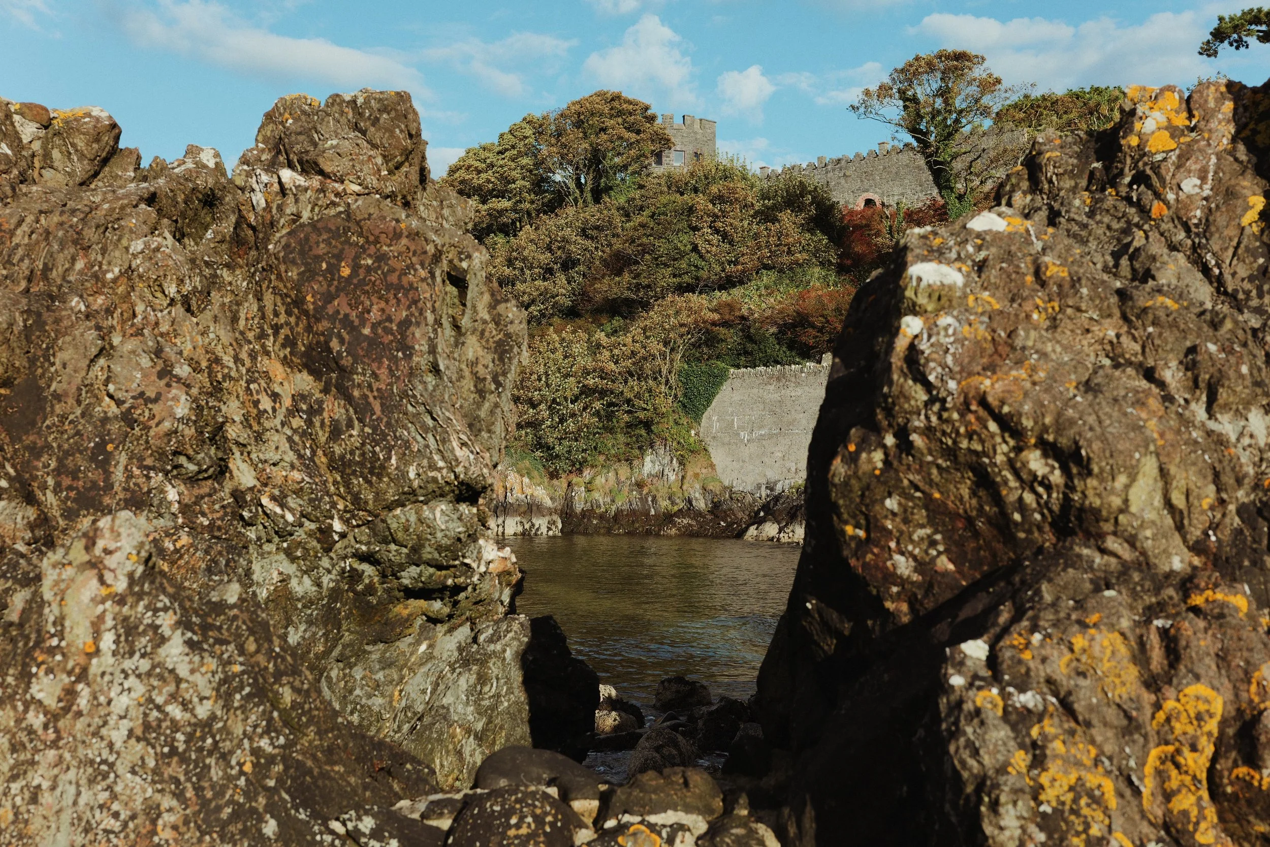
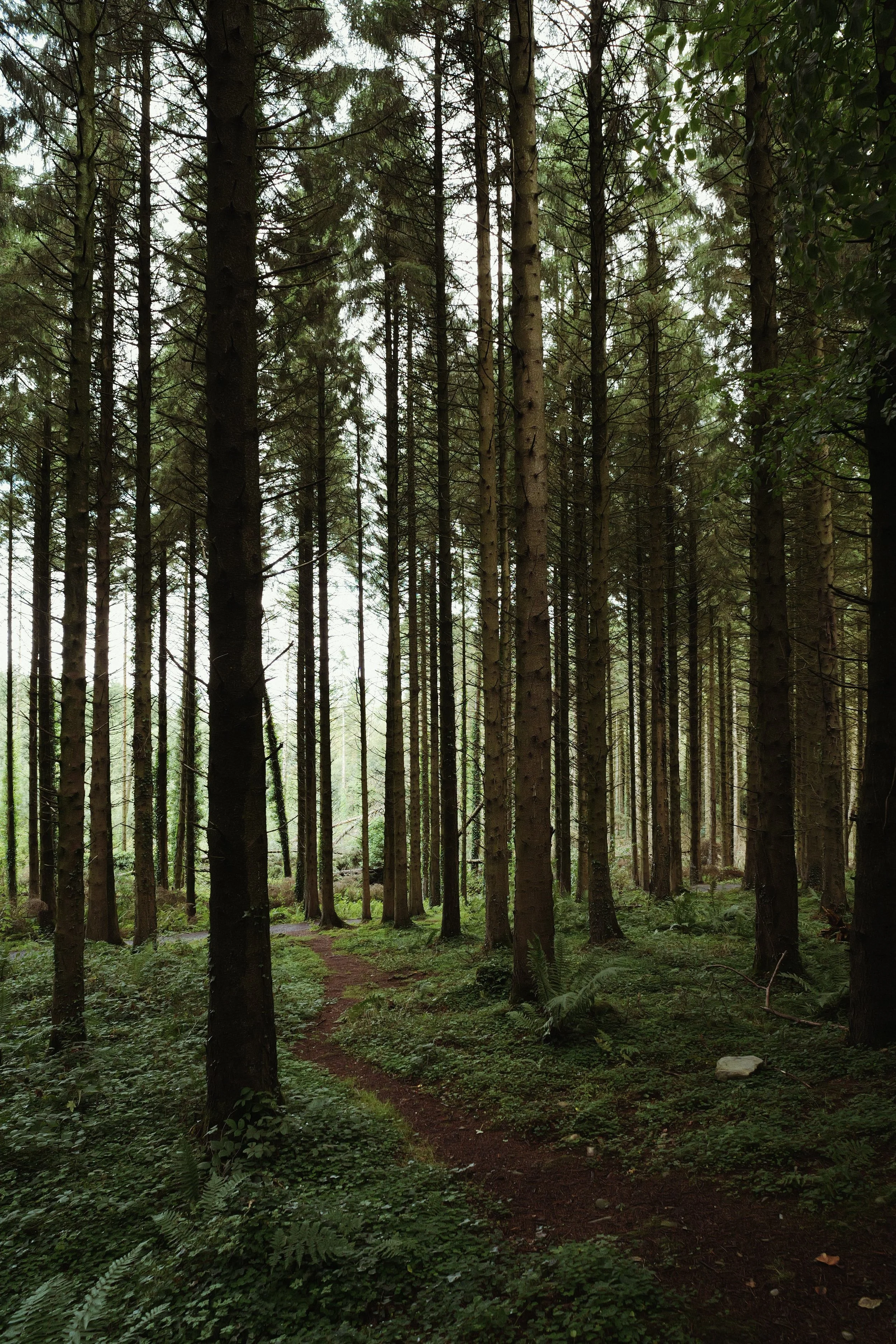
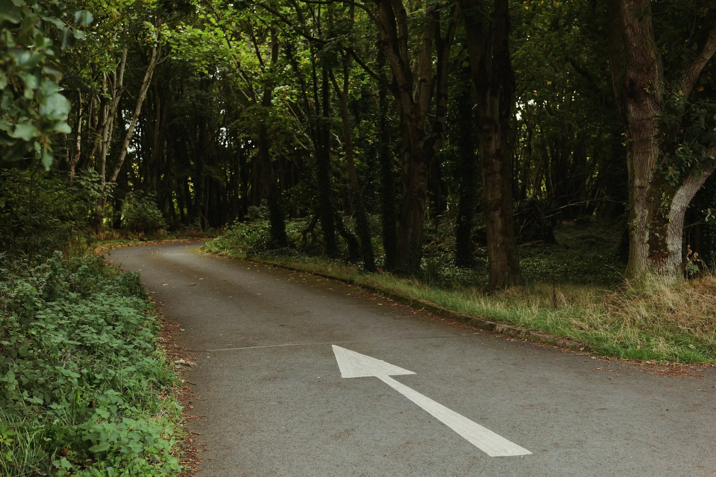

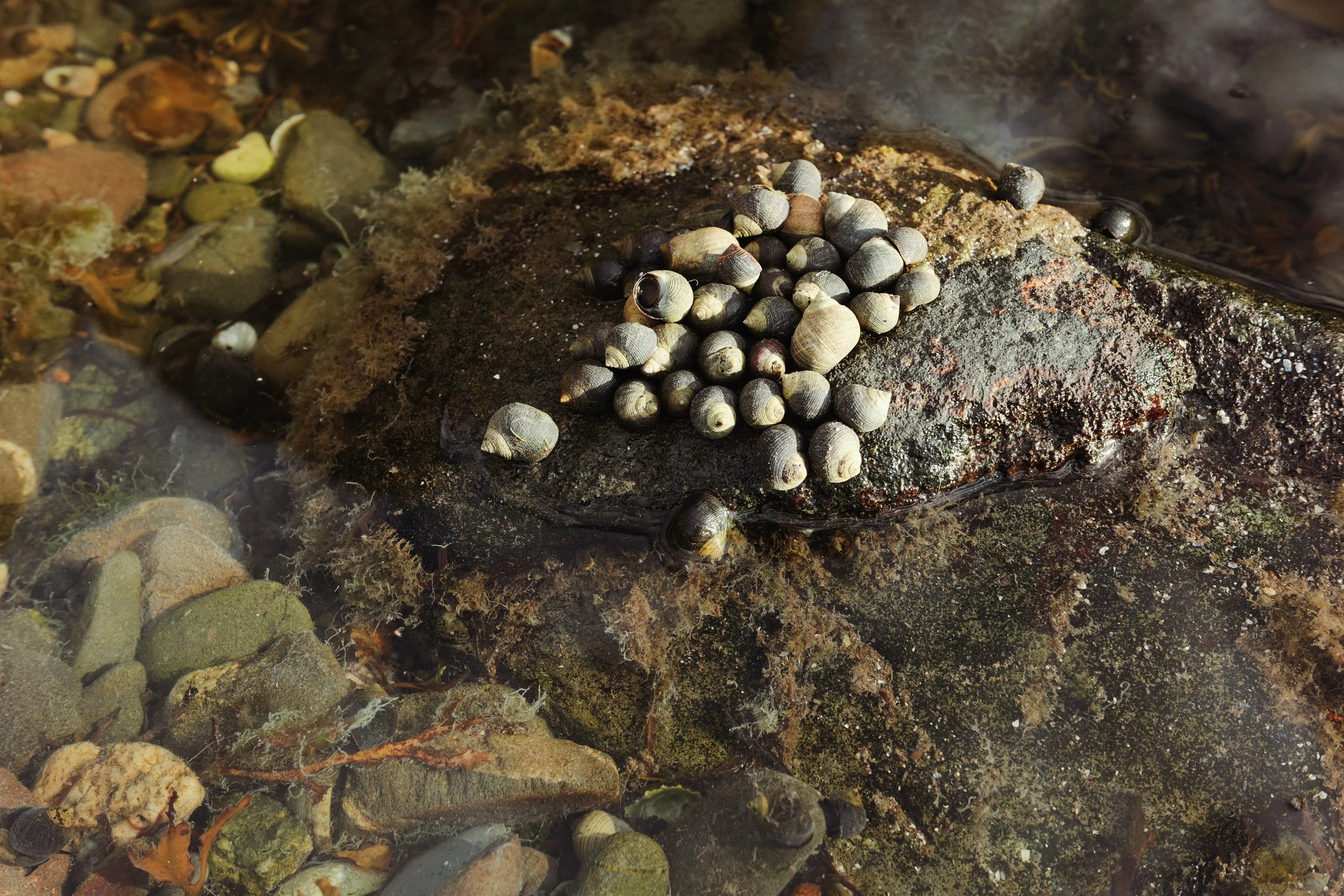

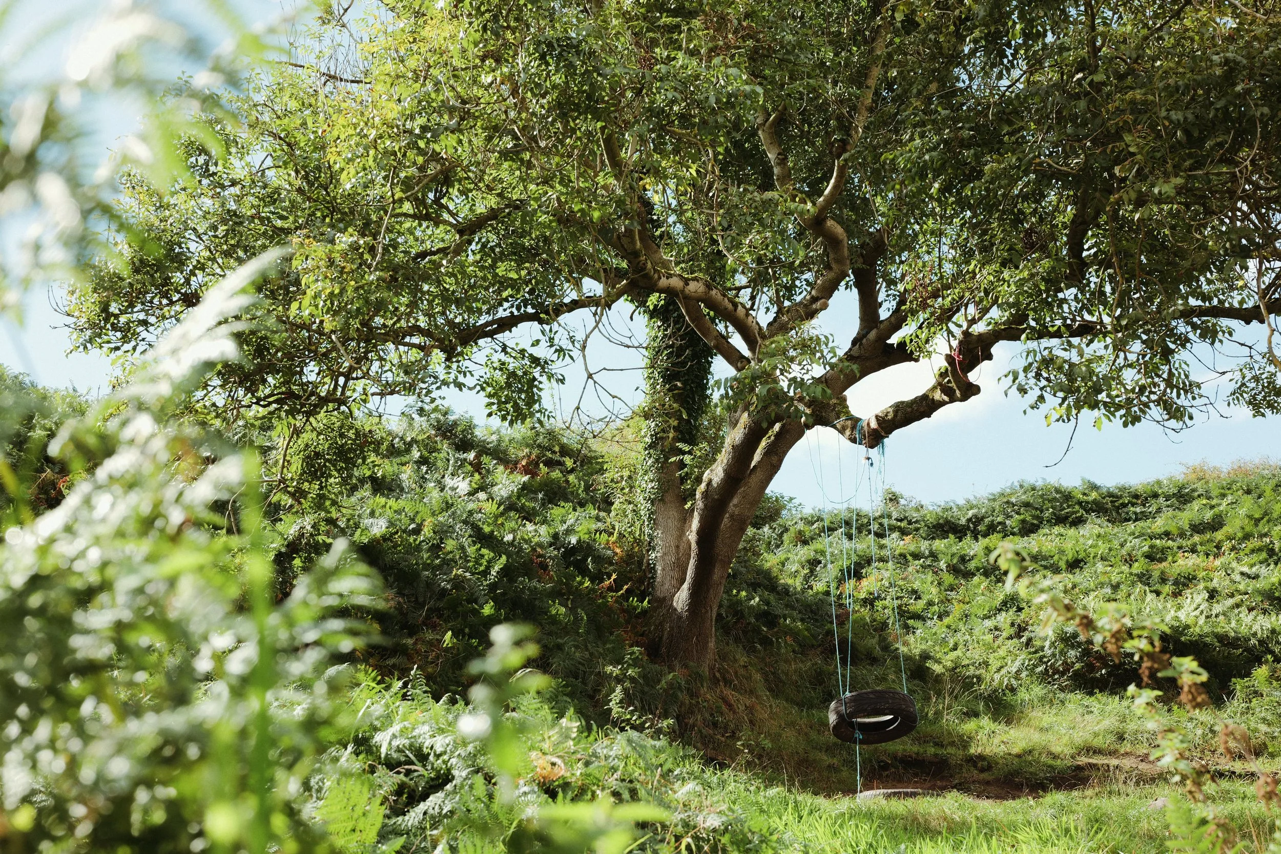
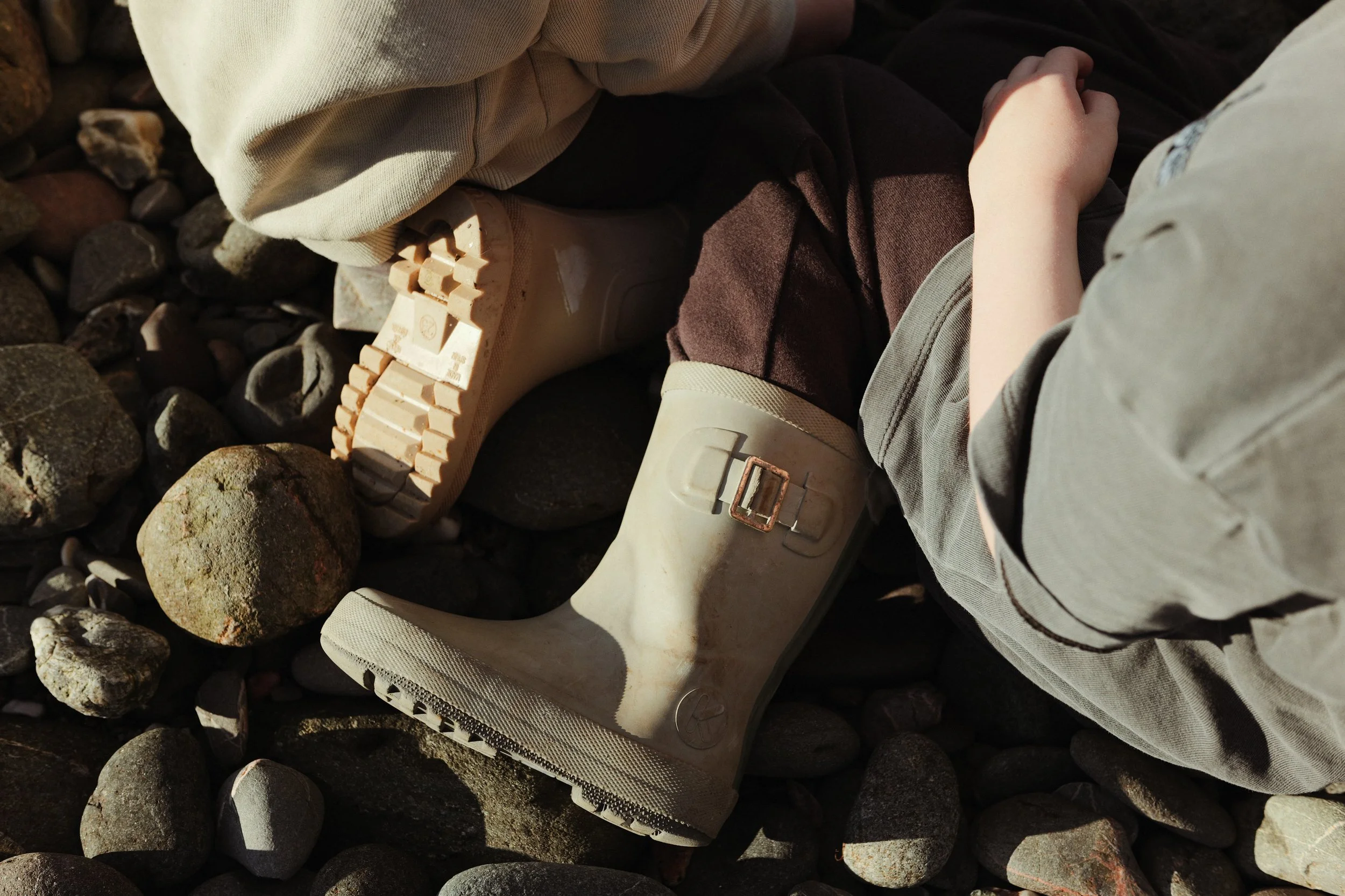
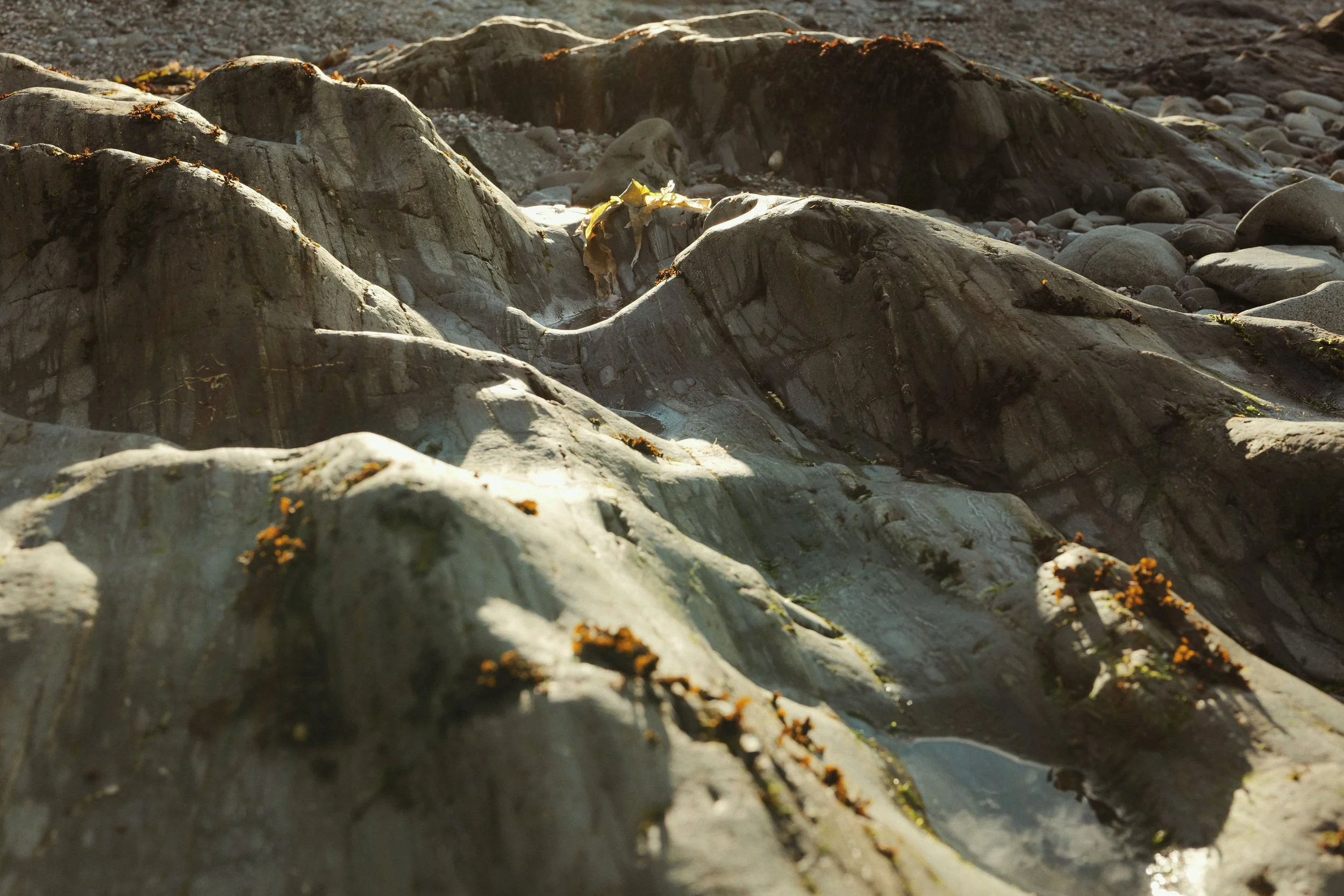
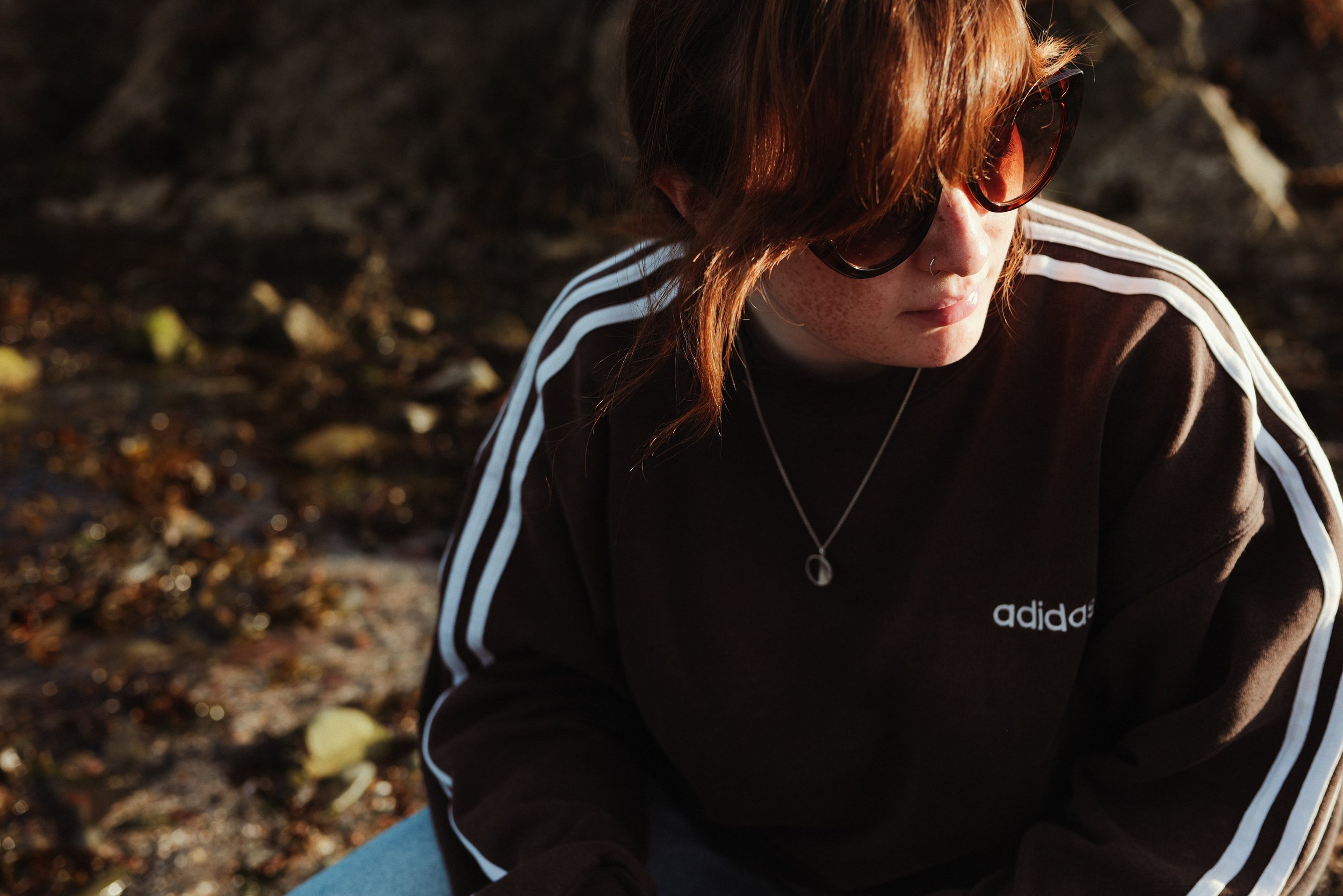
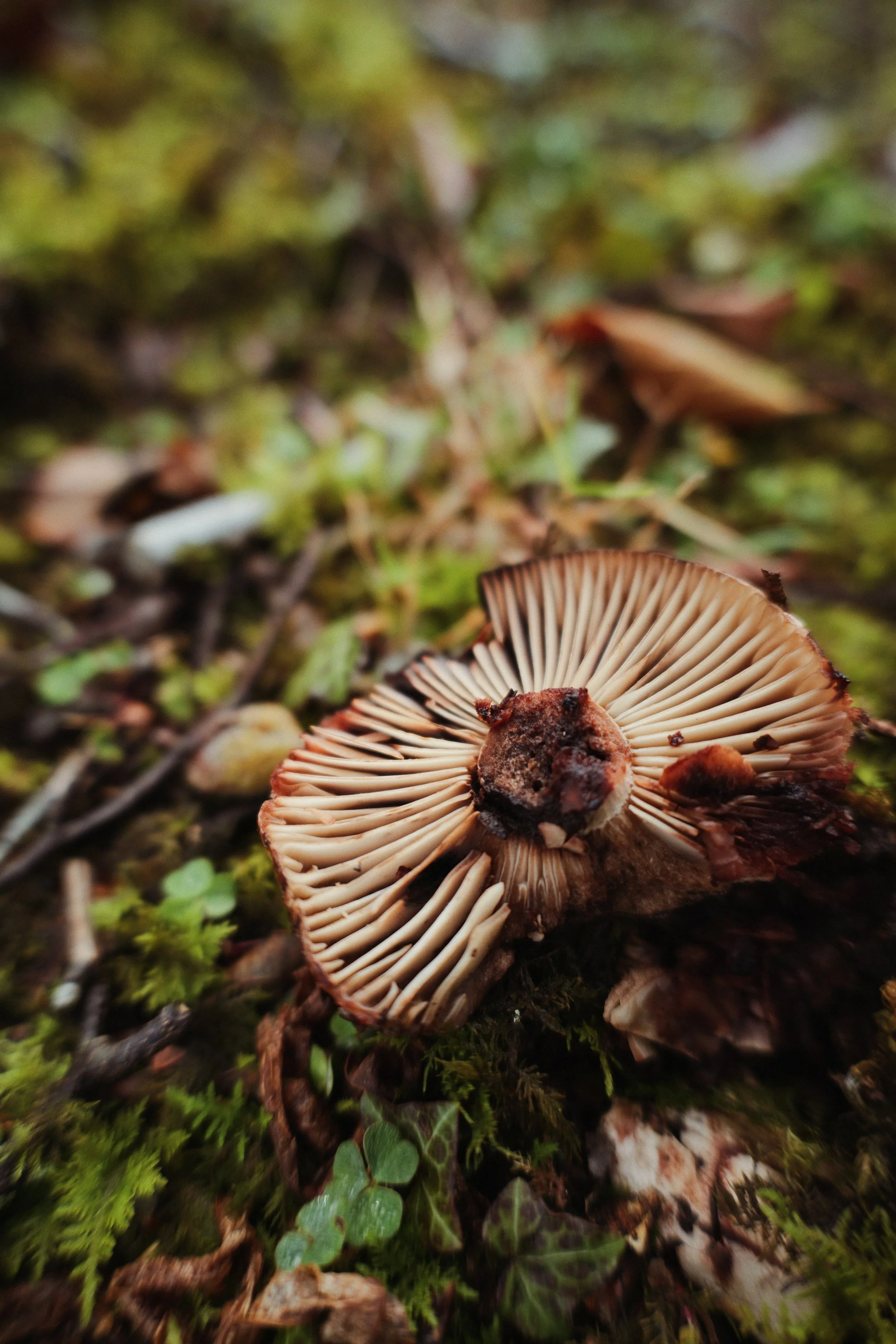

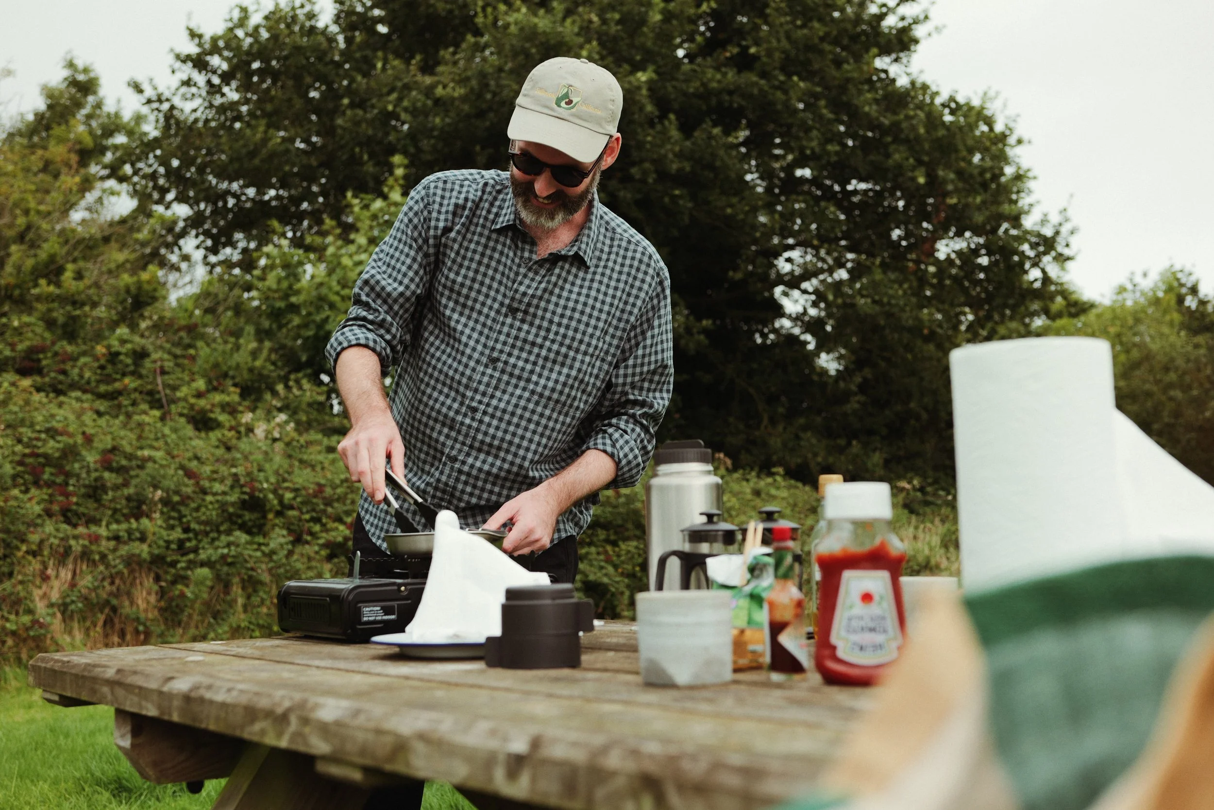
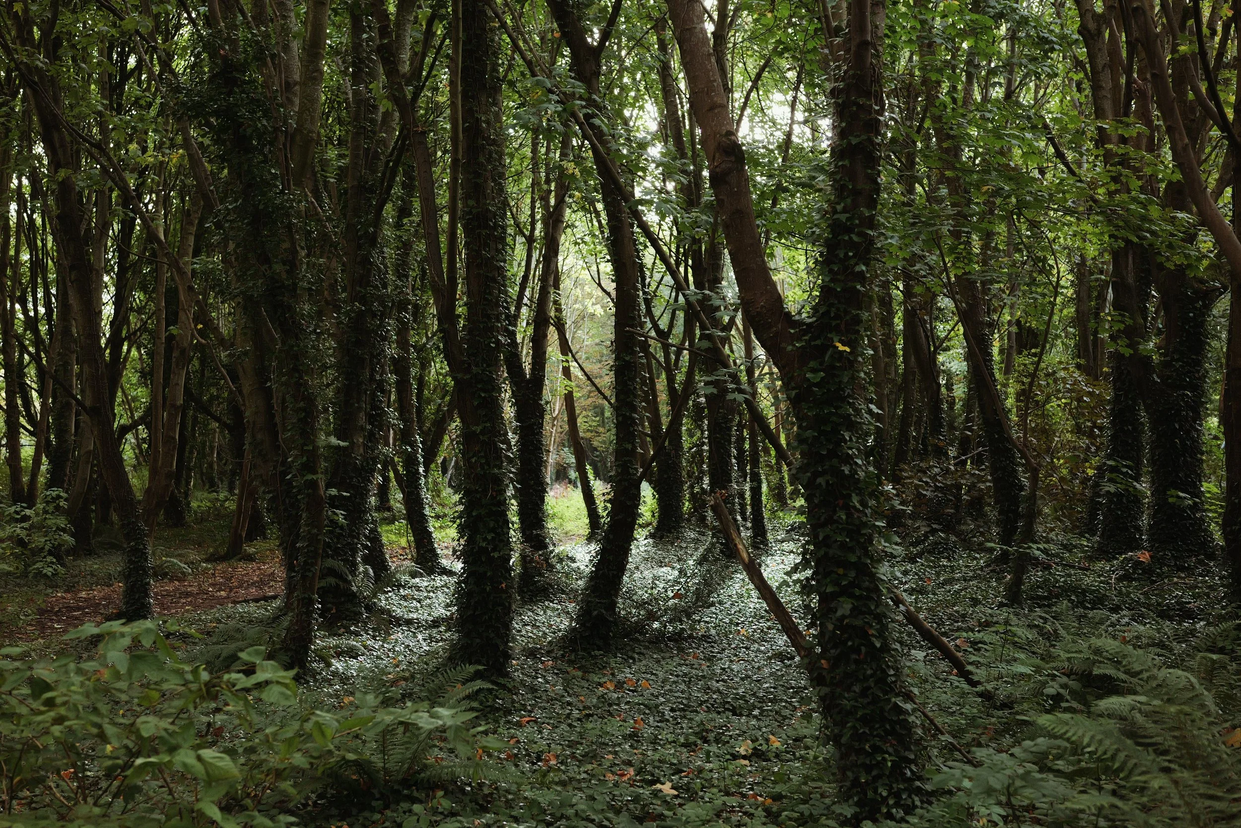
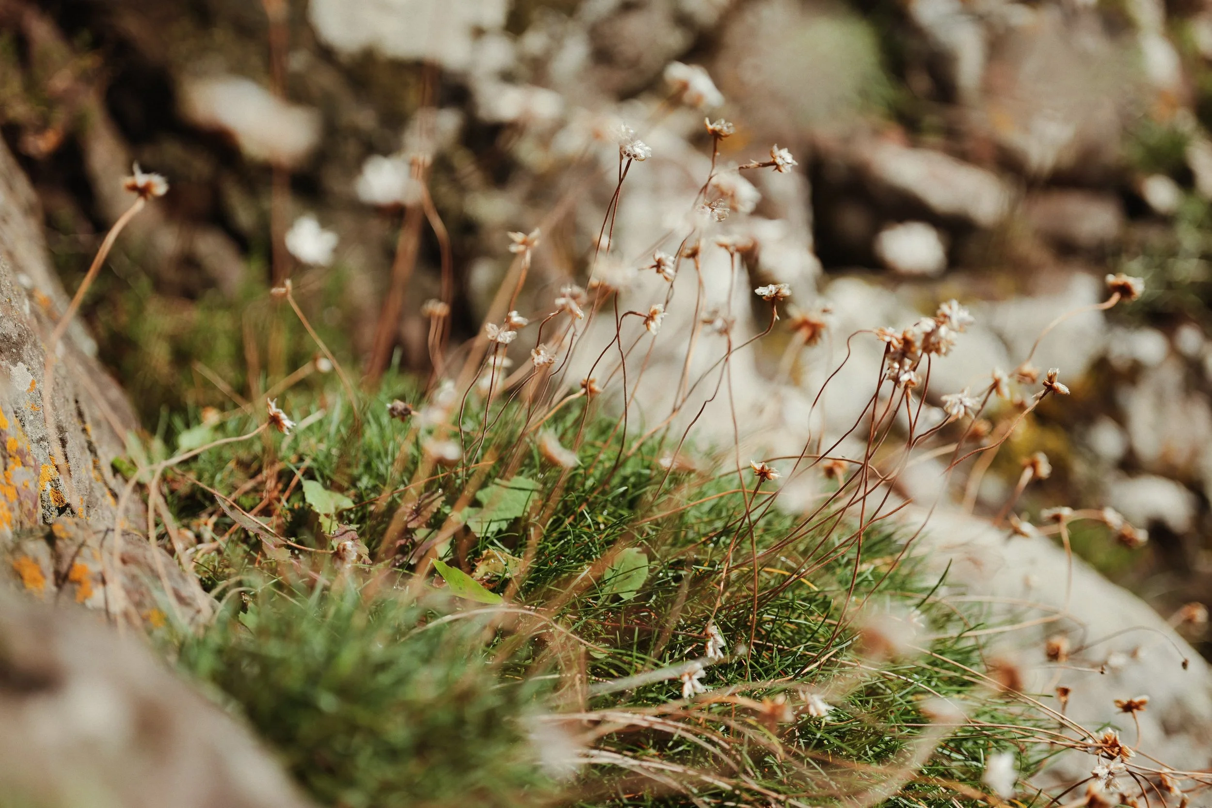
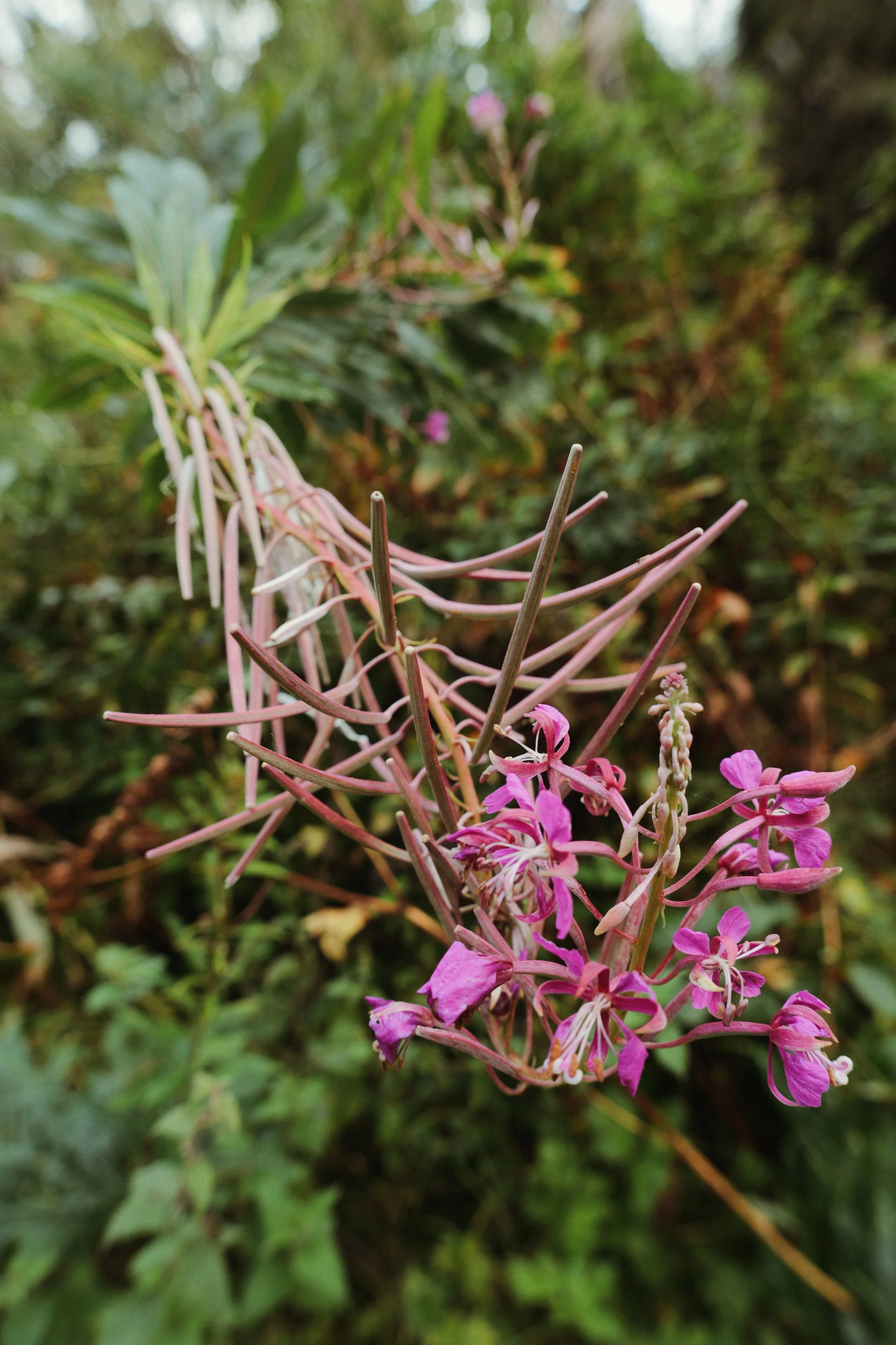
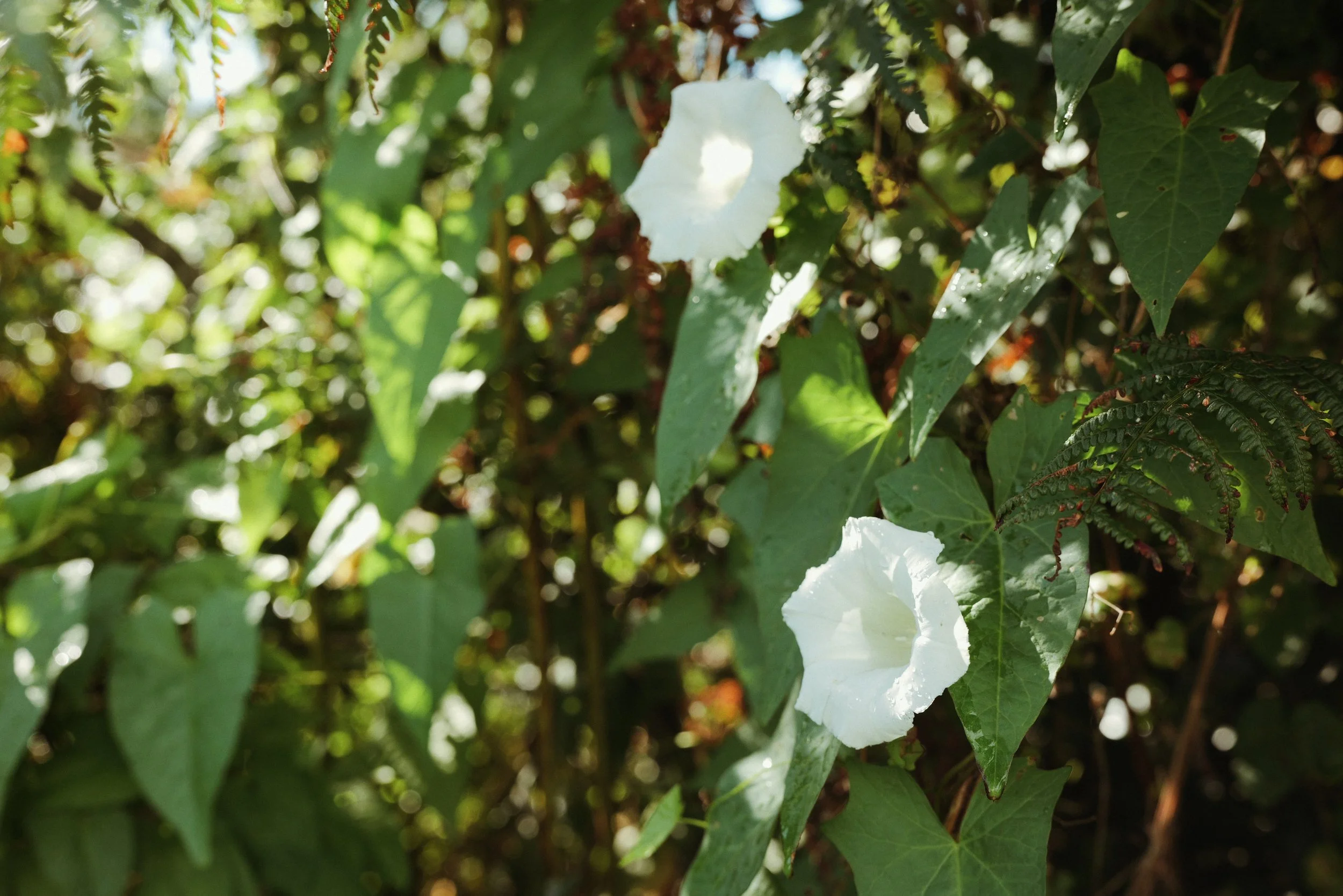
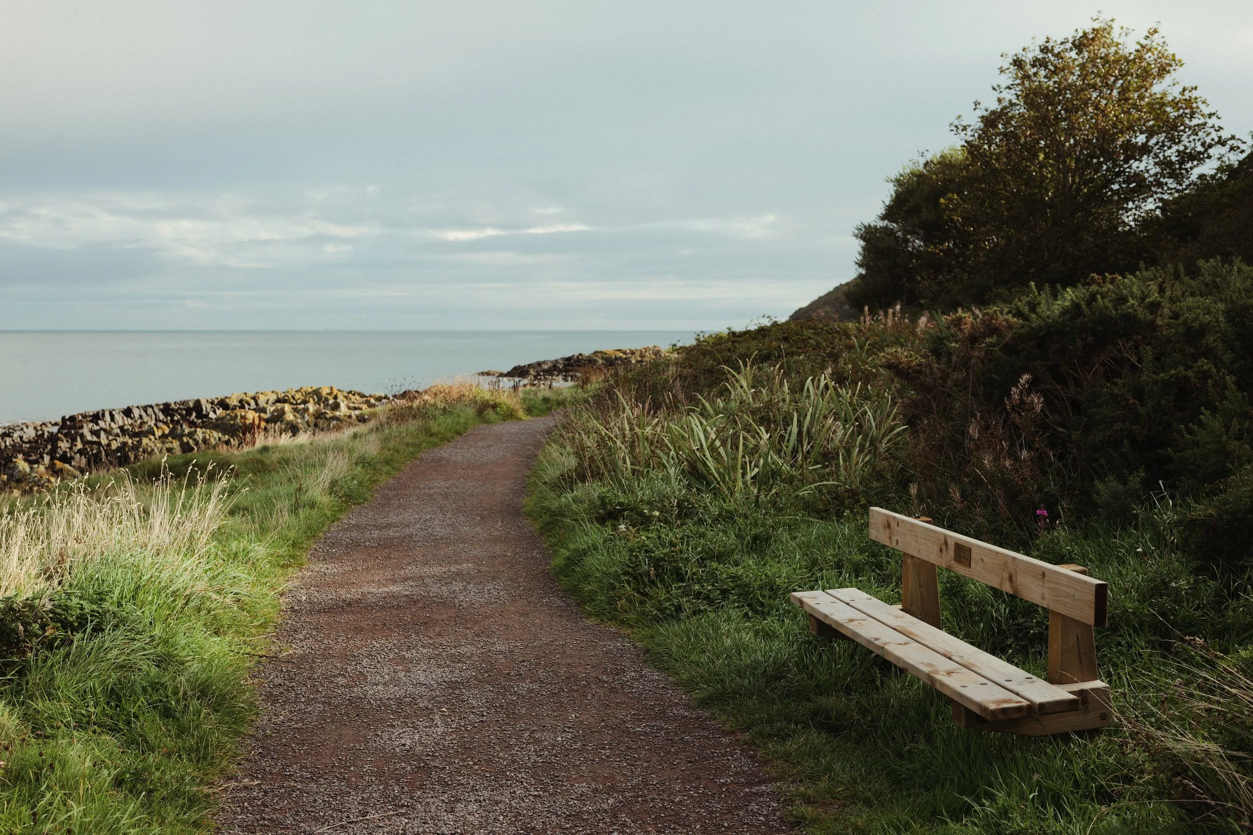
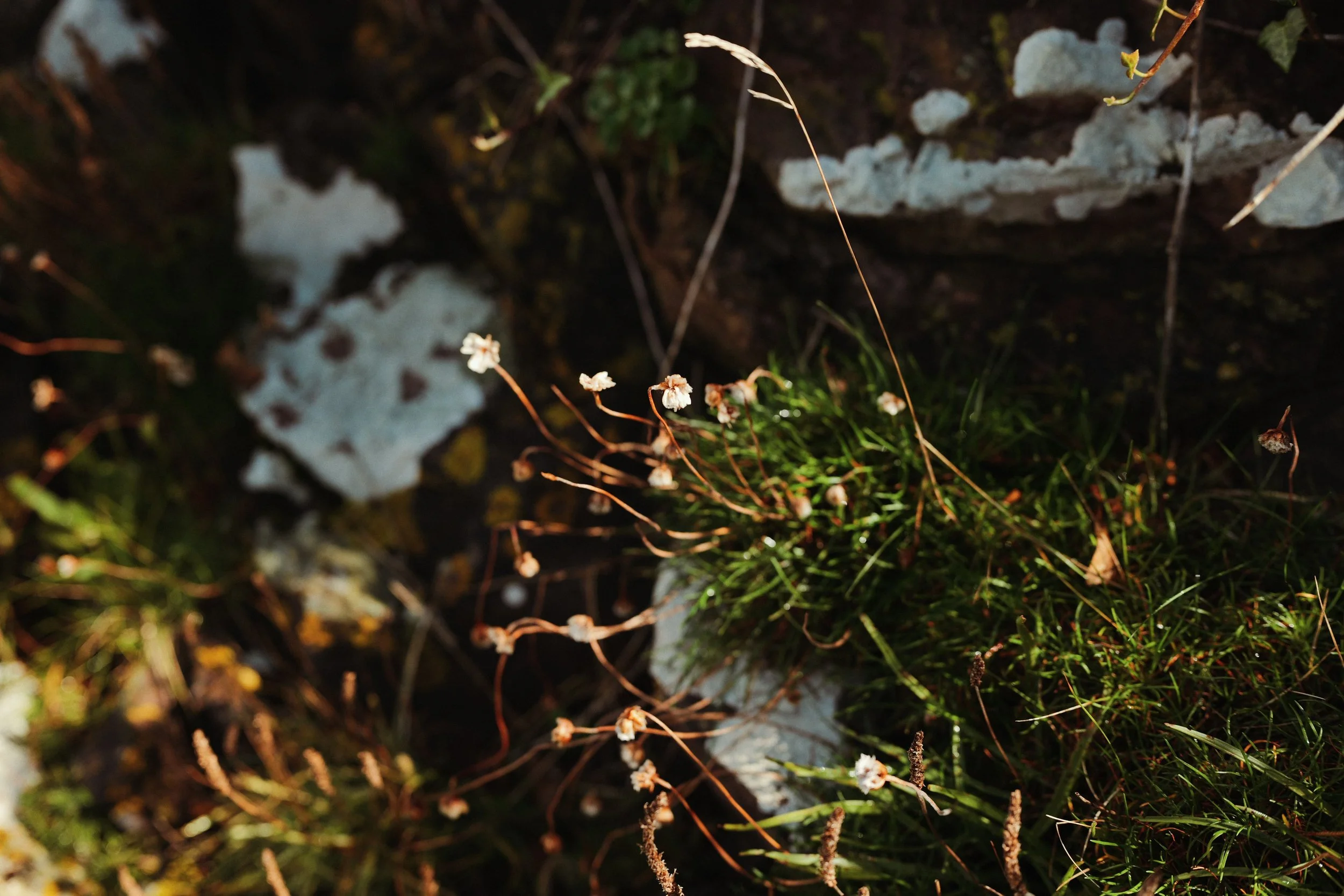
My starting point for Imperial Ultra 200 was the combination of LUTs. For this ‘look’ I’ve combined two of my favourites Daisy & Ontario (which you can download using the buttons below or find on the LUMIX Lab app if it’s easier for you.) Daisy places a really lovely pale blue almost minty hue in the mids and highlights and then applying Ontario on top really grounds the tone. I landed at a combination of Daisy at LUT Opacity 60% and Ontario at 40% and I think it looks great.
After settling on this combination of LUTs, the next setting I dialled in was the White Balance shift. I chose an Auto White Balance setting for flexibility, with a shift of (A:6 G:3) so quite warm and a little bit green. It’s this shift (controlled by a Saturation setting of -1) combined with my two LUTs that’s bringing this ‘look’ alive!
Another feature of Imperial Ultra 200 is the combination of LOW Grain (my favourite grain setting) with quite a lot of sharpness. Some people prefer to shoot their JPEGs with no additional sharpness, if that’s you simply turn the Sharpness setting to -5. Me… I think the Sharpness setting of -2 for this ‘look’ gives the perfect balance.
So what is this ‘look’ good for. Well anything really. It wasn’t designed to replicate any particular film-stock, or for any particular scenario. It arrived simply from a combination of LUTs and My Photo Style settings that excited me and the result is a ‘look’ that really really like. I’ve been using it to shoot everything over the last few months. It’s great for portraits, landscapes, family stuff, everything really. It’s a warm ‘look’ that’s flexible and versatile, but also has a lot of personality. Why not load in the LUTs and the settings below to try it out for yourself…
Imperial Ultra 200
[by rossandhisjpegs]
Photo Style: Natural
Contrast: 0
Highlights: -1
Shadows: -1
Saturation: -1
Hue: 0
Grain: LOW
Color Noise: OFF
Sharpness: -2
NR: -5
i.Dynamic Range: OFF
White Balance: AWB (A:6 G:3)
LUT 1: Daisy by rossandhisjpegs
LUT 1 Opacity: 60%
LUT 2: Ontario by rossandhisjpegs
LUT 2 Opacity: 40%
As featured in this video…
If you enjoyed this post, why not drop something in the Tip Jar below to say thanks. It would be massively appreciated!