

Kodak Gold 200
After months of studying scans, developing, testing, adjusting, refining etc. I am so happy to finally be sharing my Kodak Gold 200 ‘look’ with you all. Kodak Gold 200 is one of Kodak’s cheapest film stocks which means it is one of their most used, well-loved and well-known too… so I wanted to get this one right!
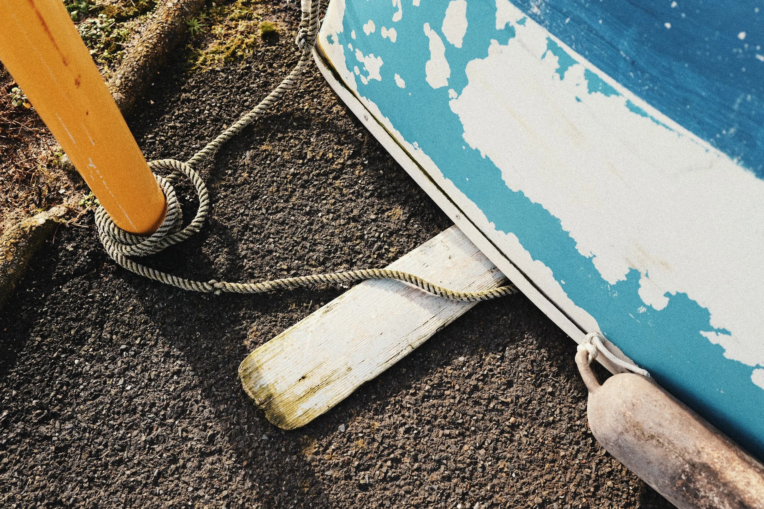
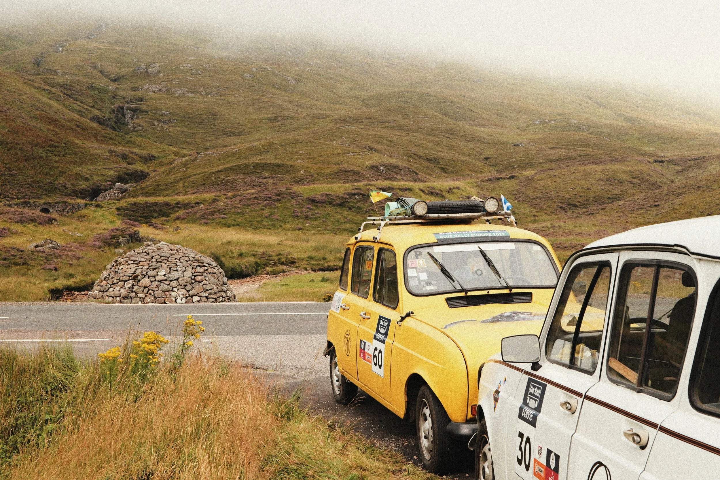
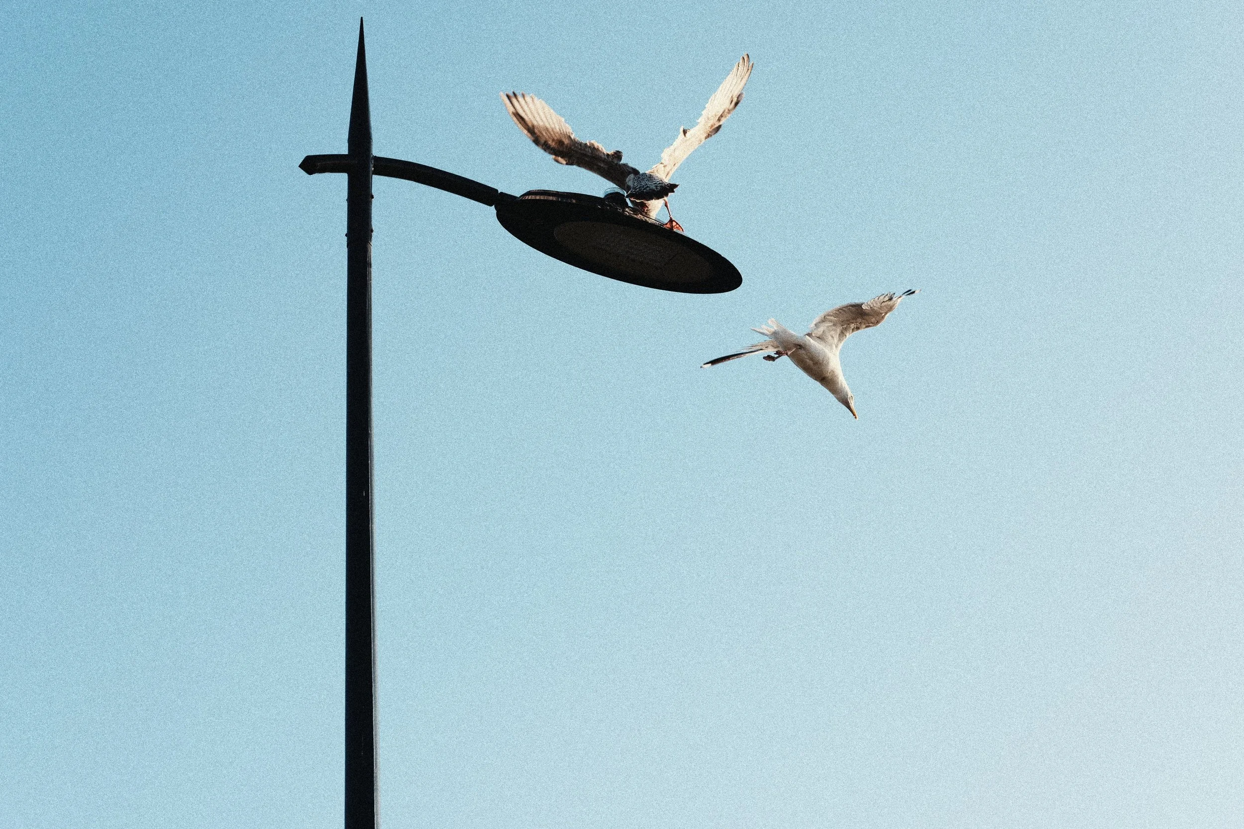
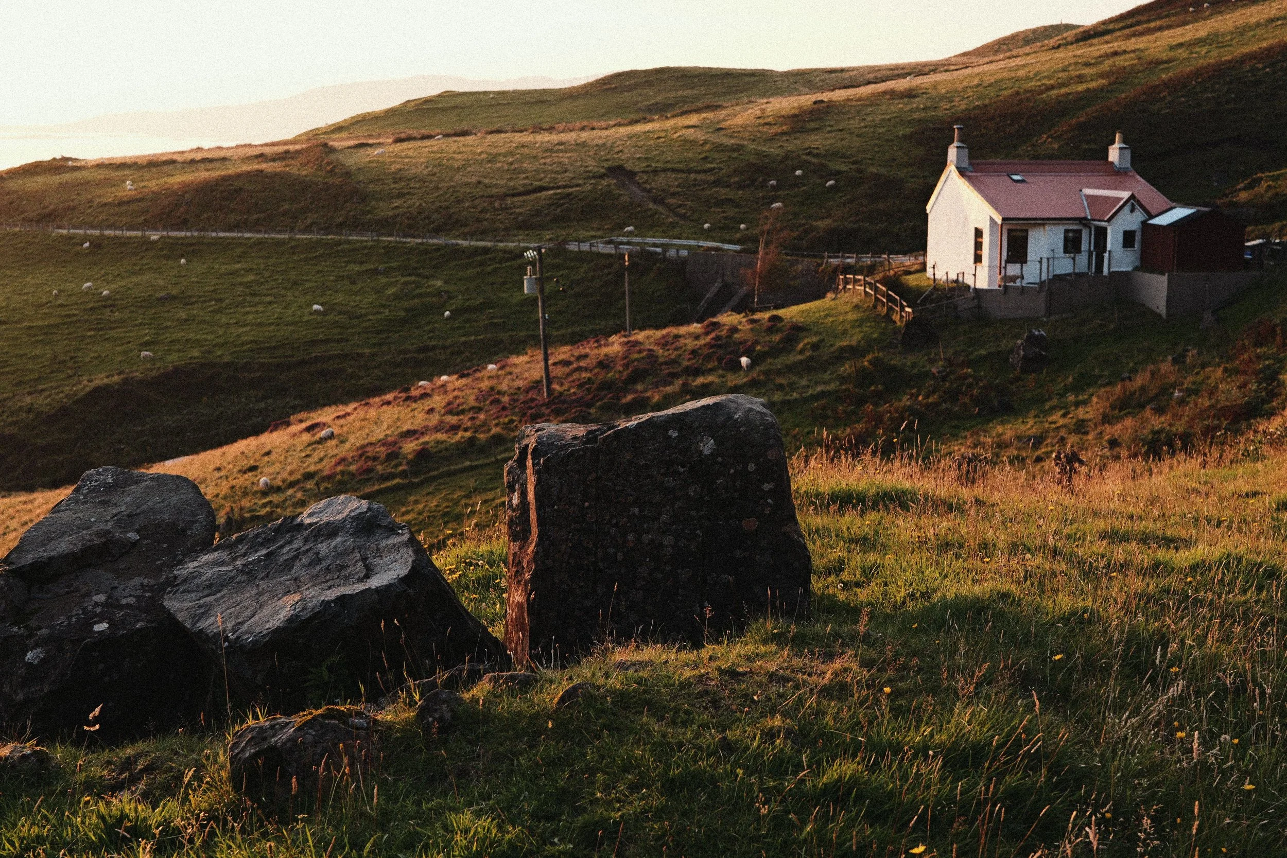
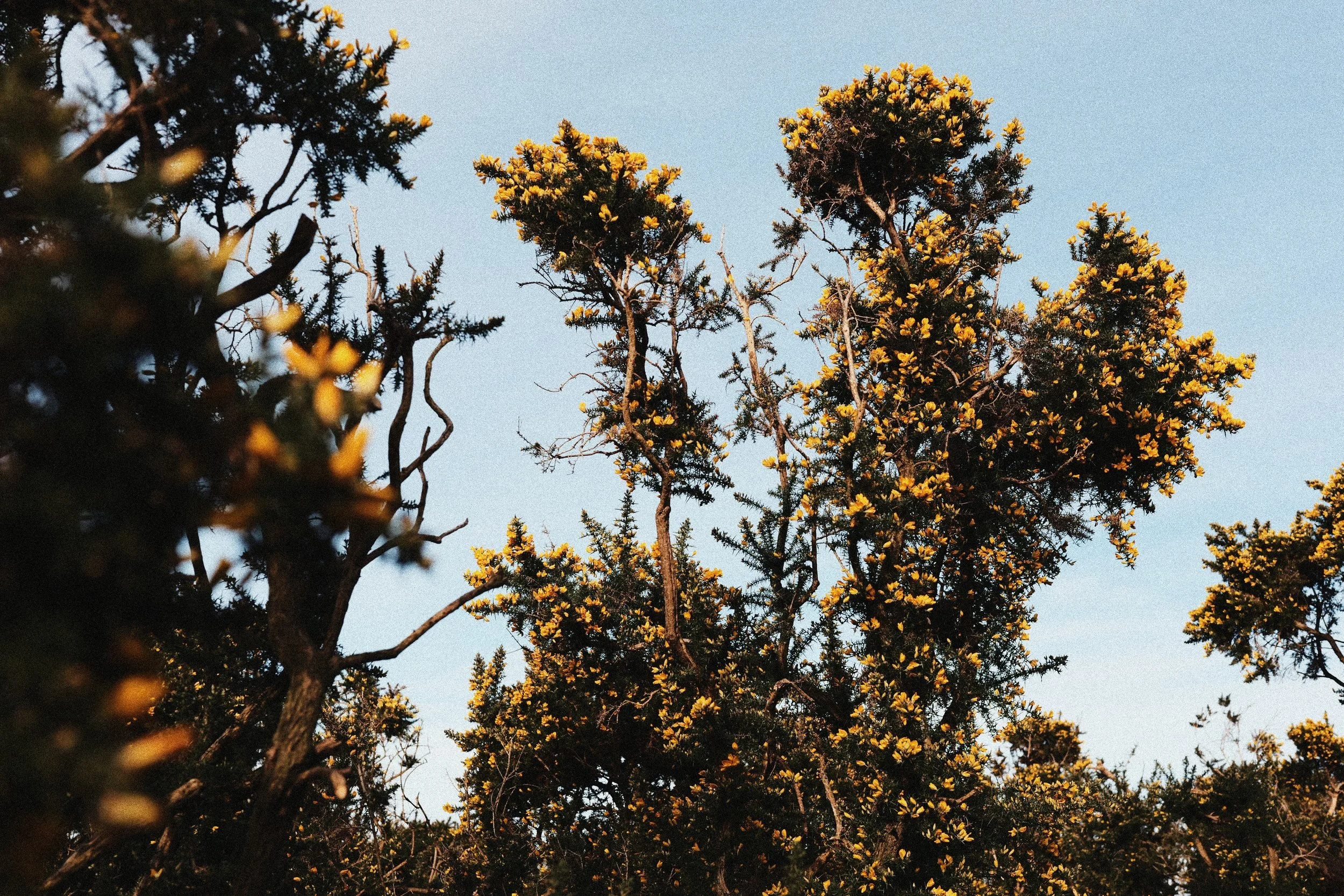
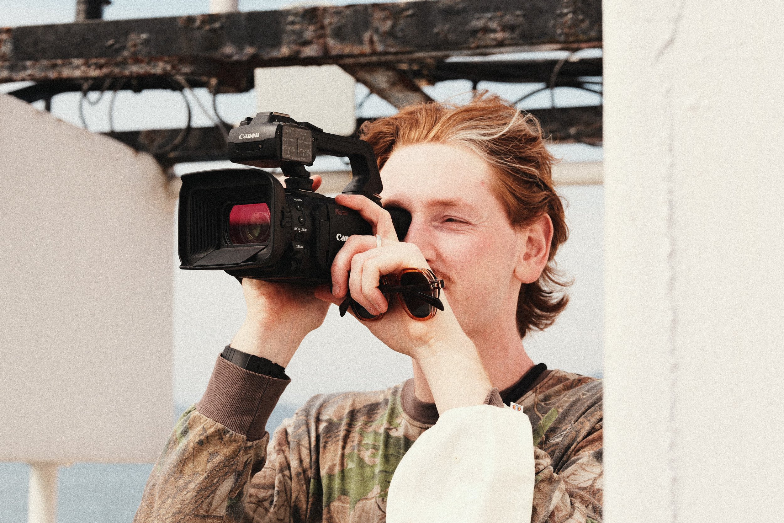
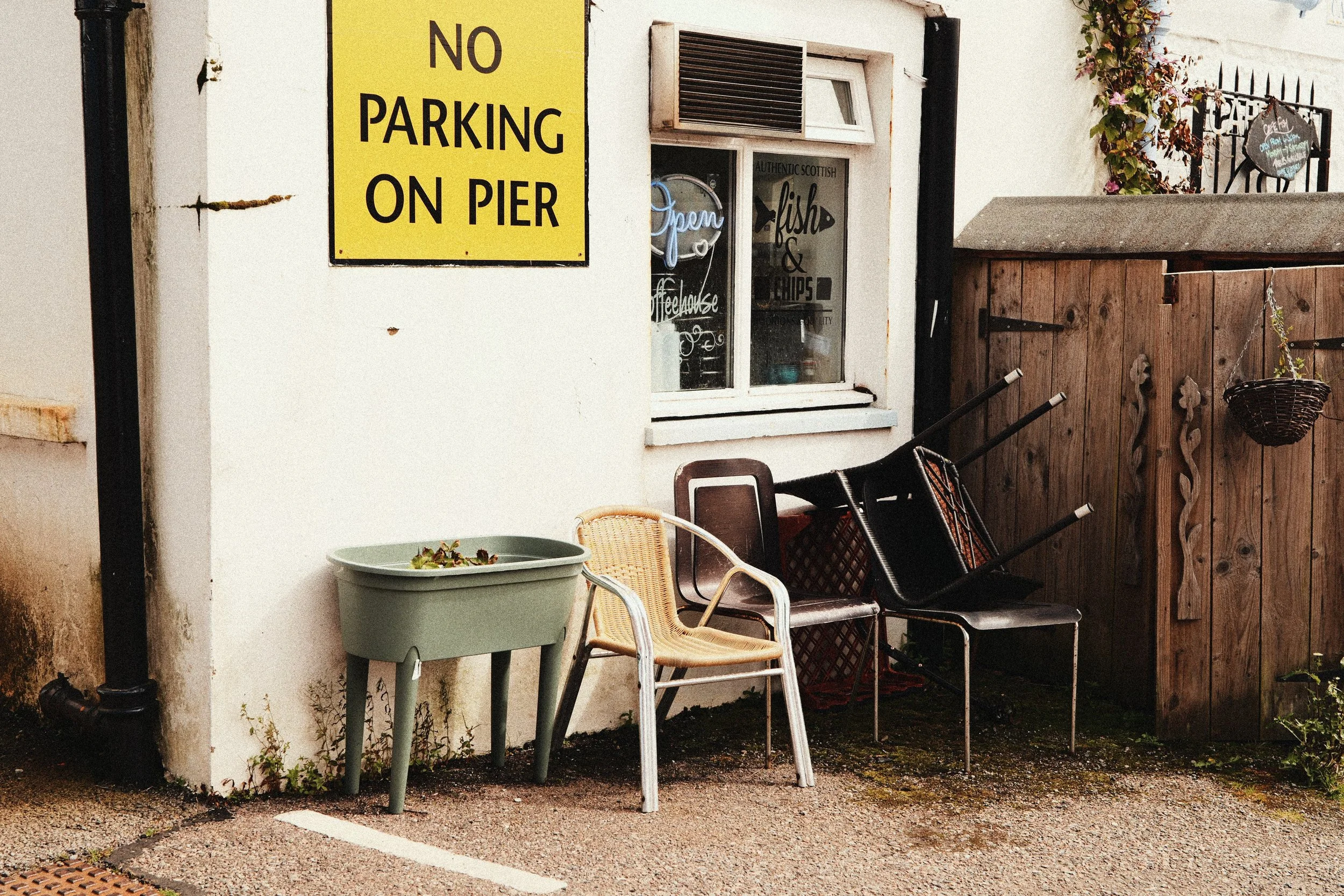
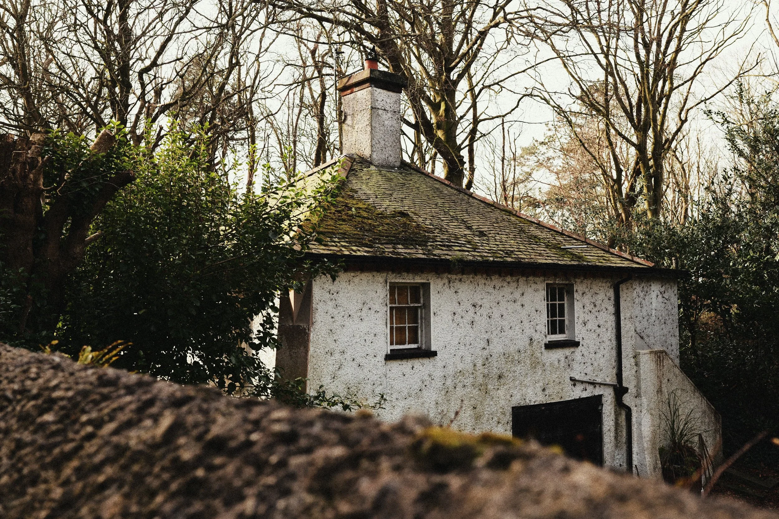
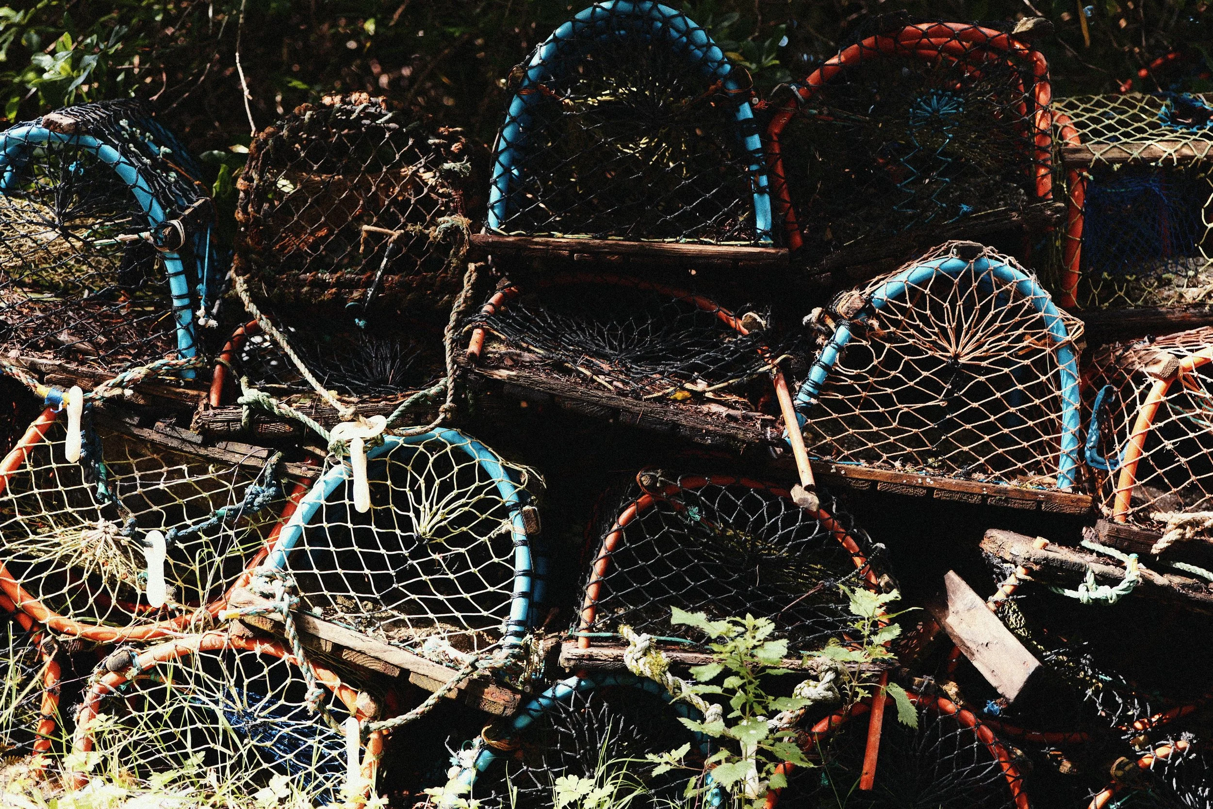
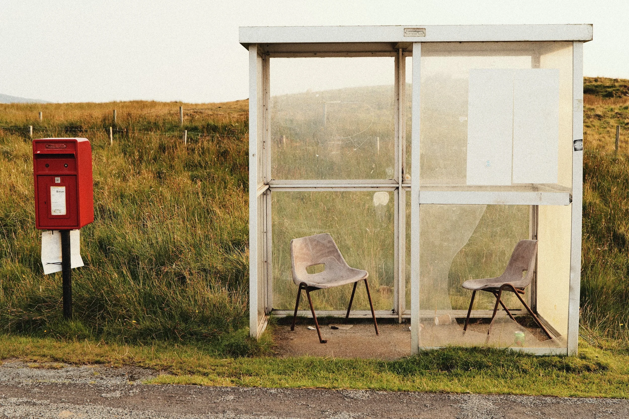
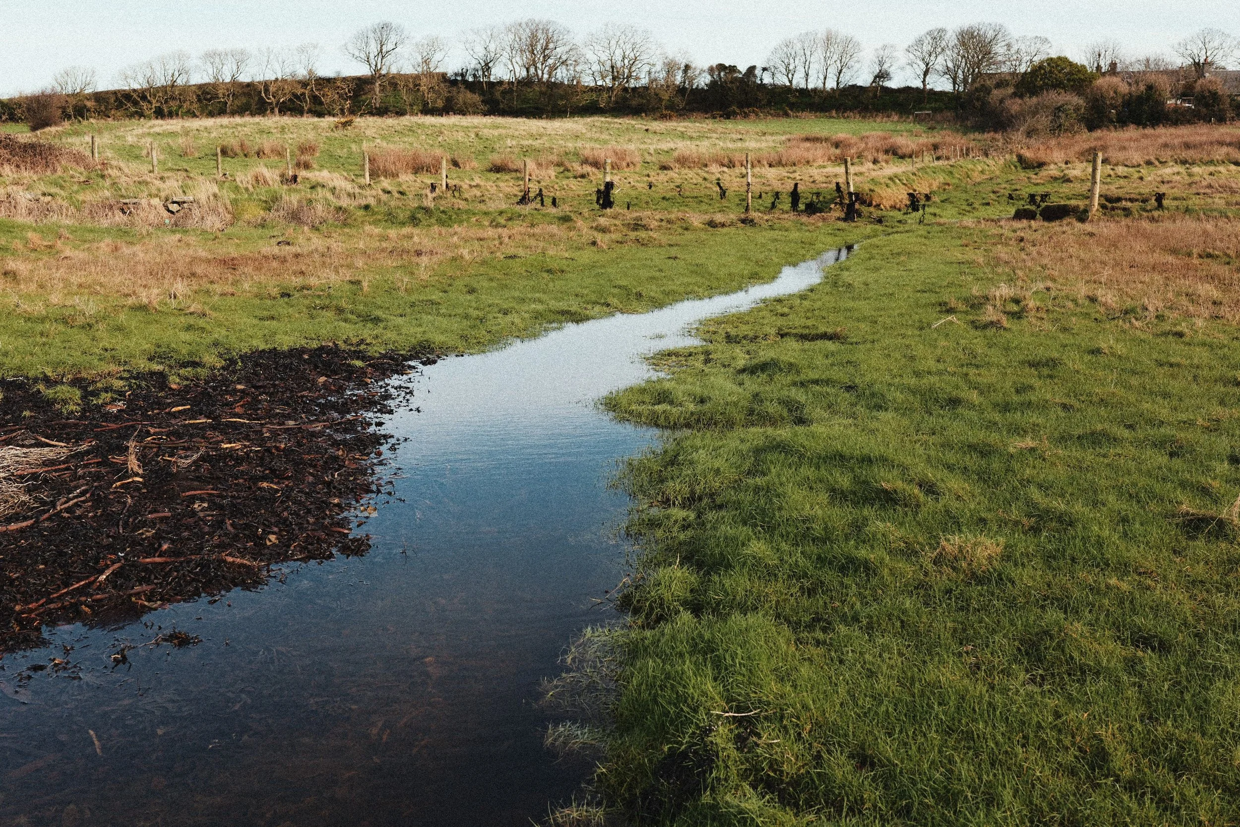
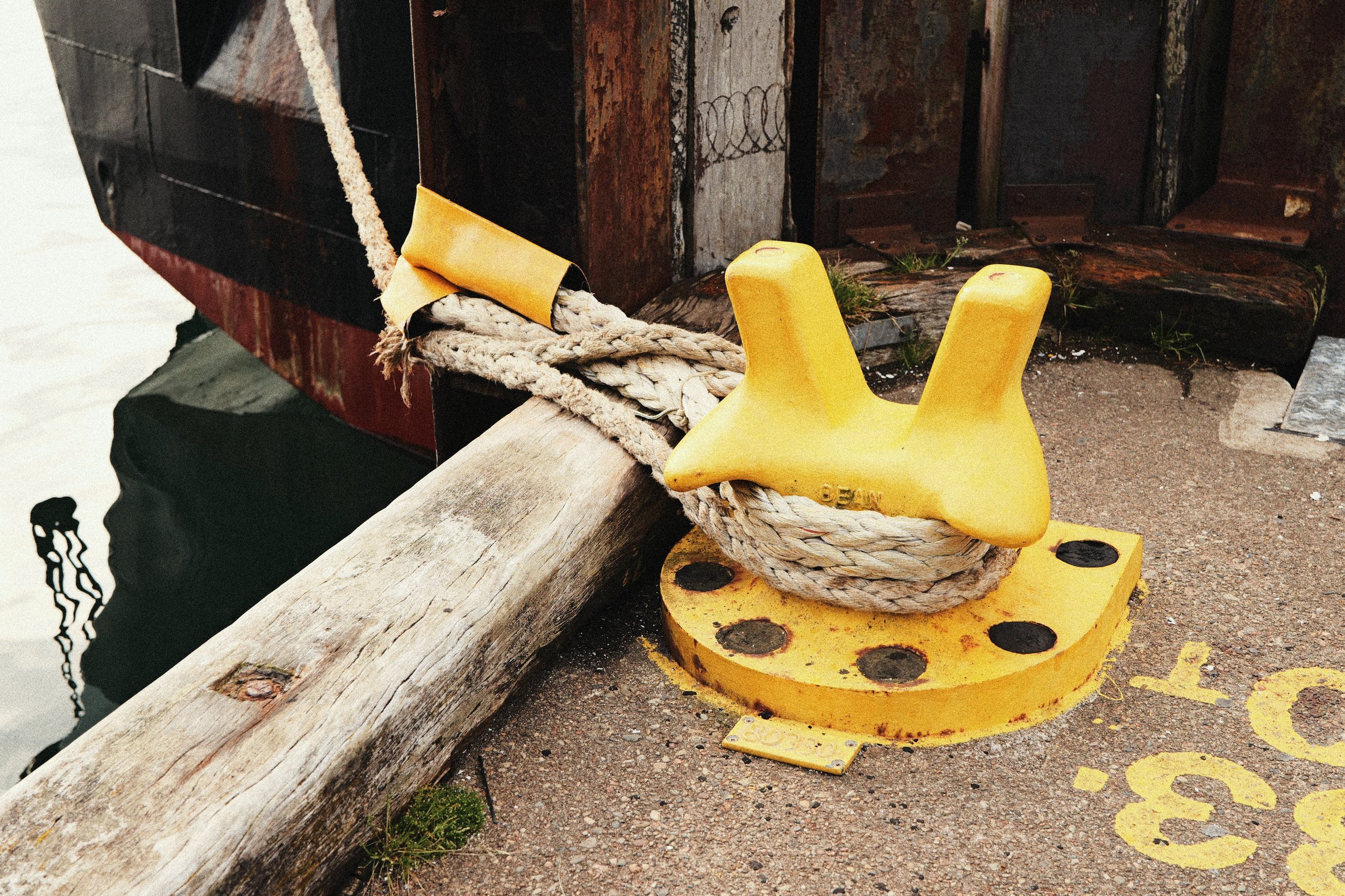
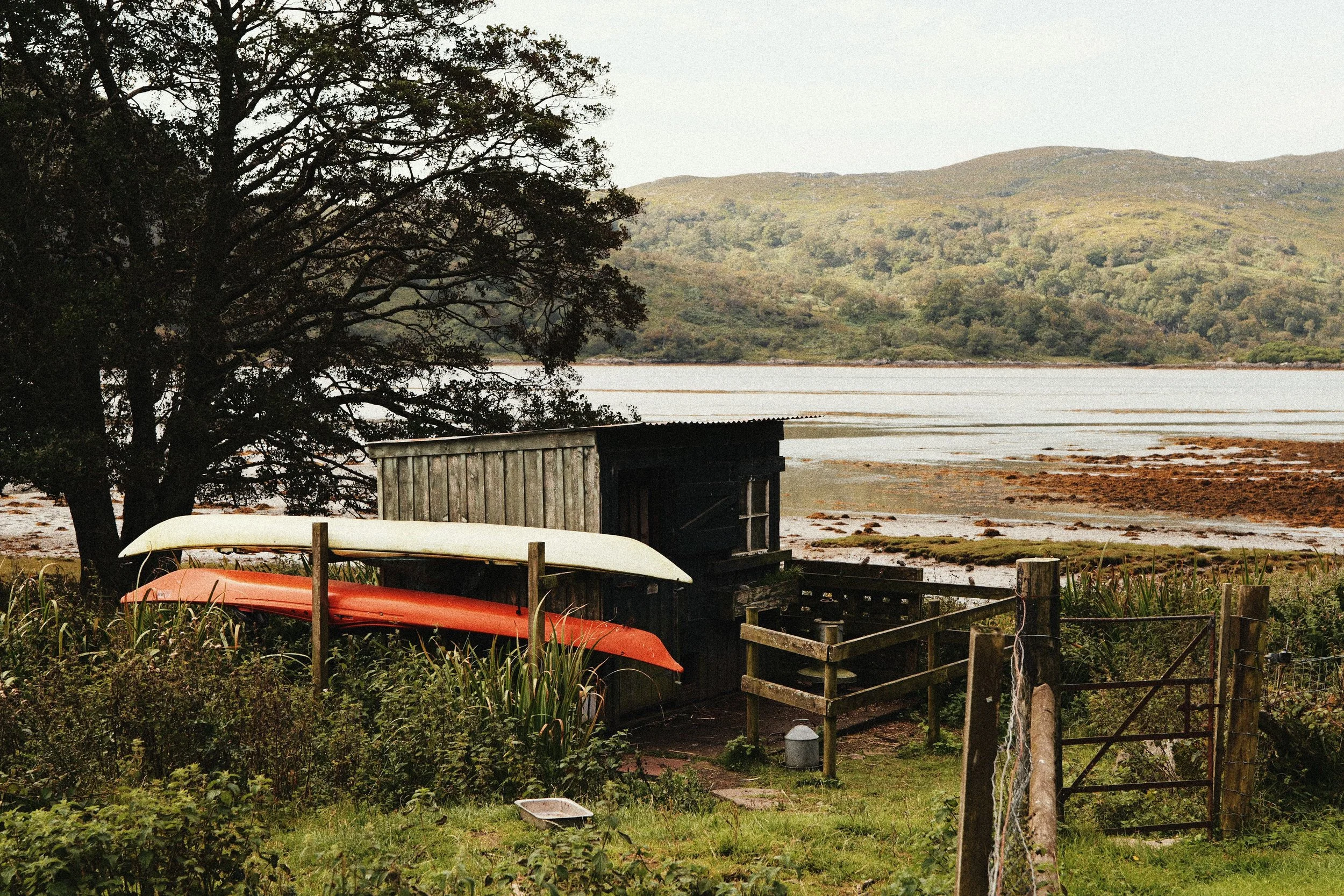
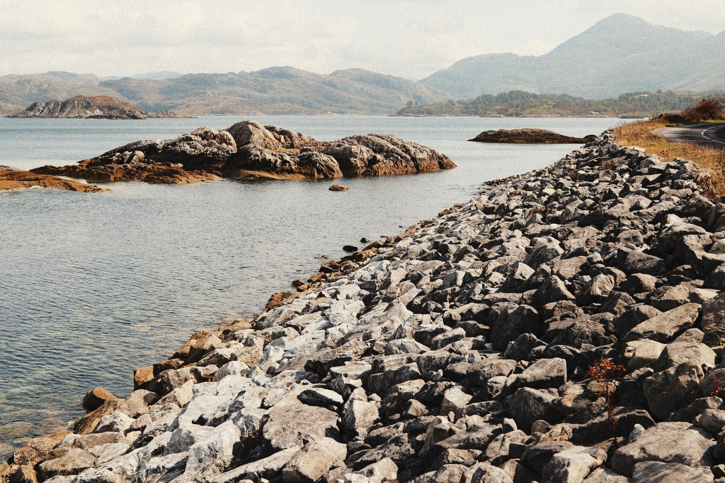
Like all film stocks, the look of Kodak Gold really depends on how it is shot/developed/scanned and so when studying this film I stuck to examples I liked that were crunchy, contrasted, warm and grainy. This to me is what this budget film stock is all about. Some people aim for a softer, more pastel look but the look of Kodak Gold I prefer (and the one I’ve tried to replicate with this LUMIX ‘look’) is on the punchier, crunchier, grainier side.
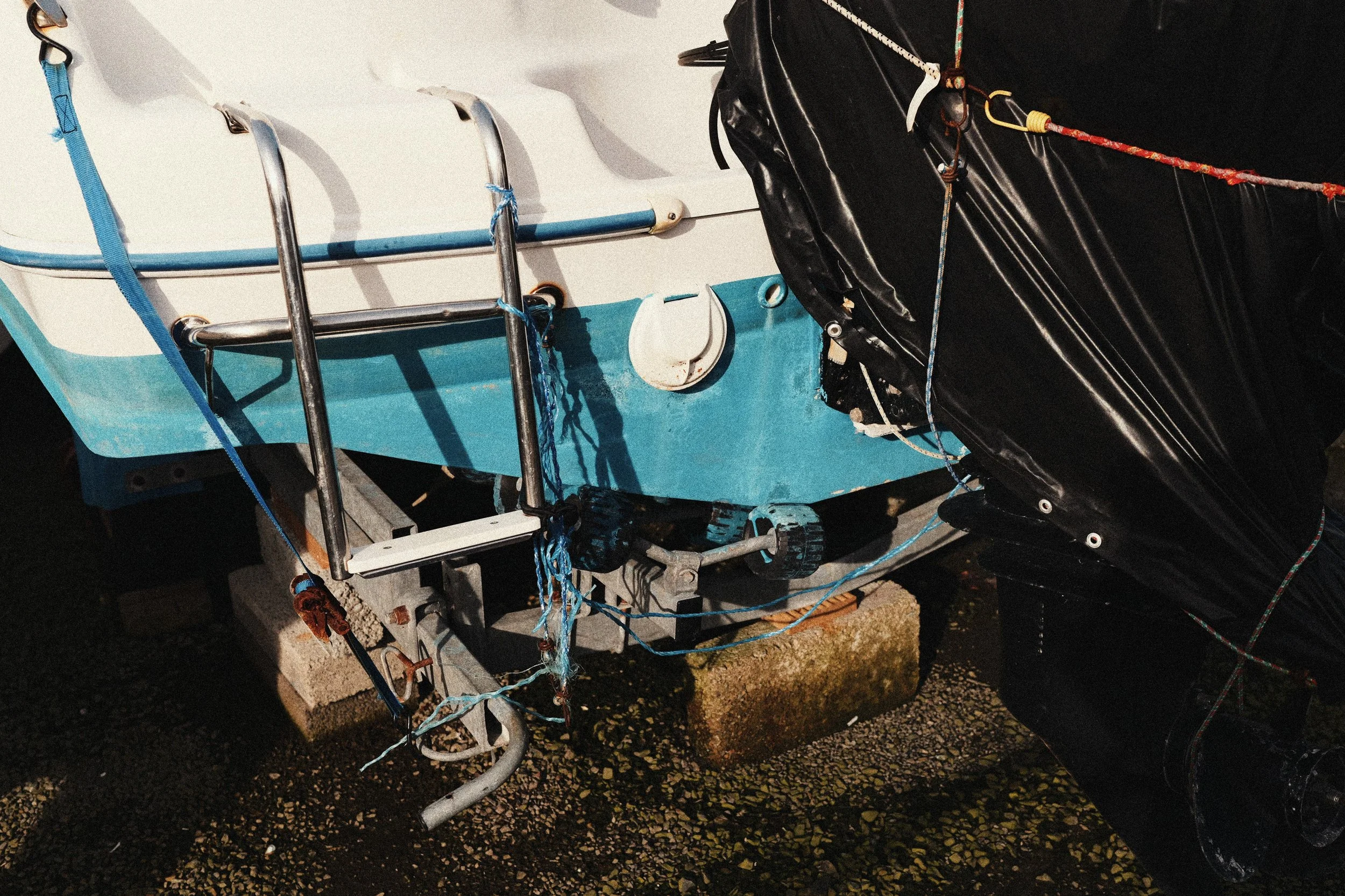
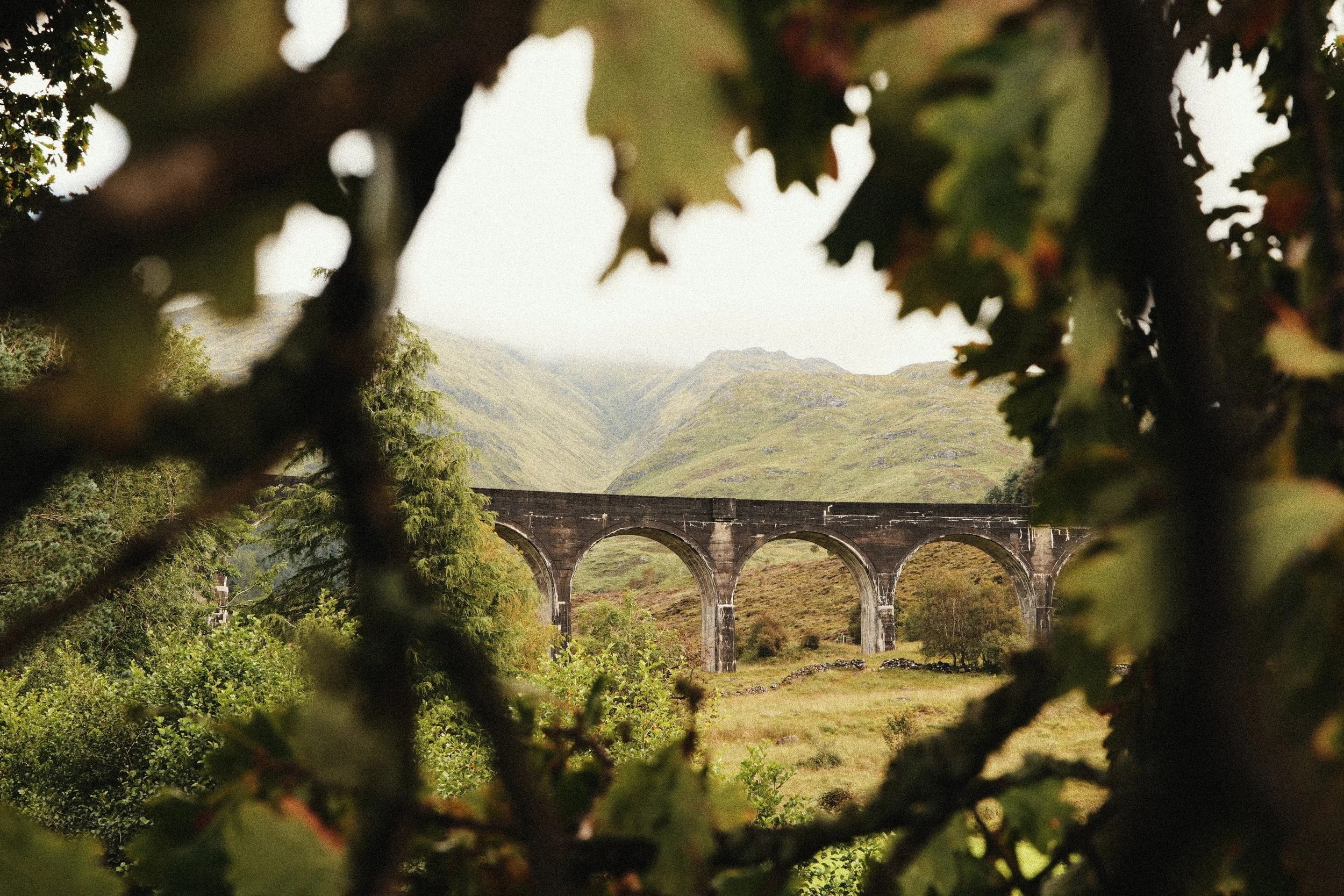
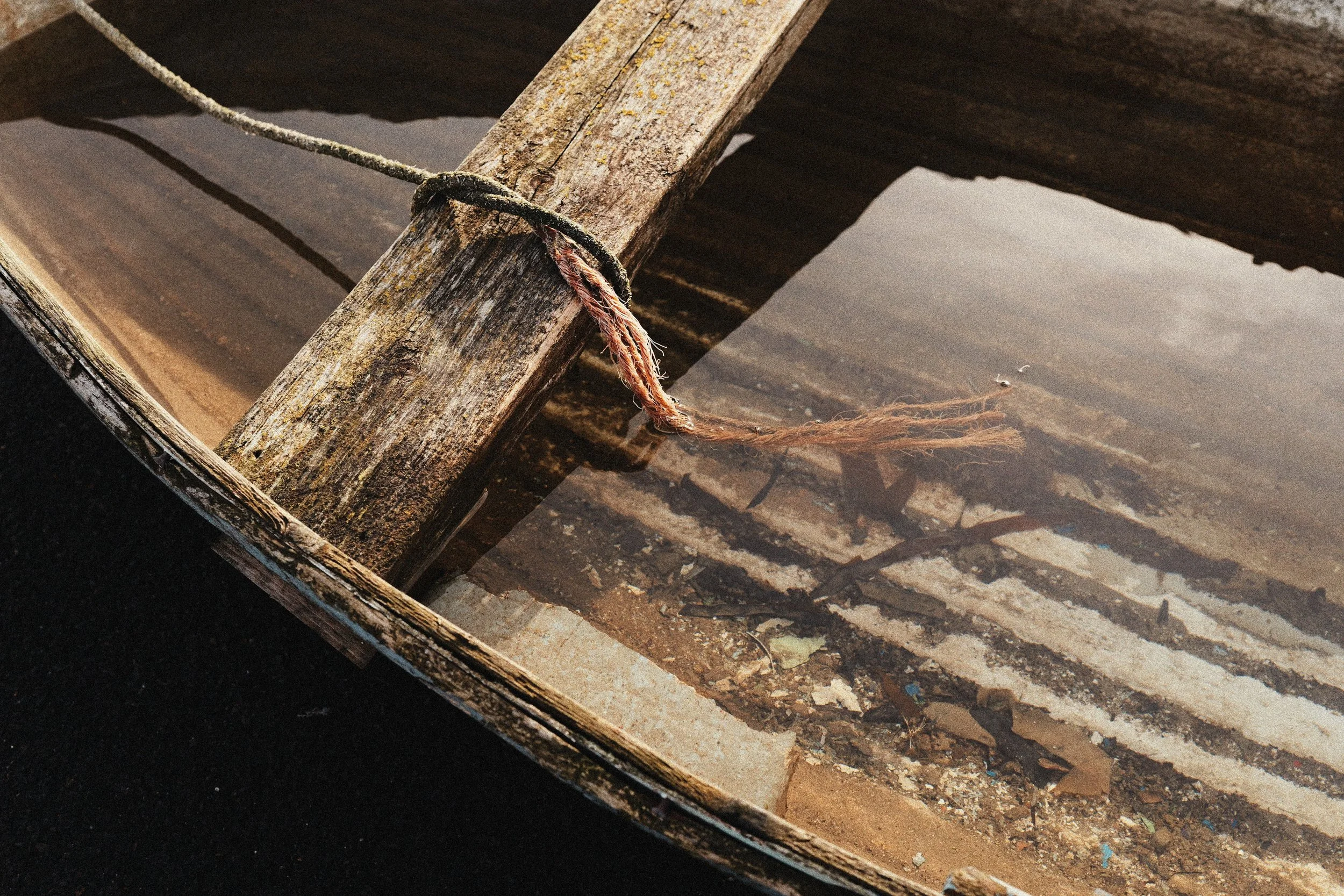
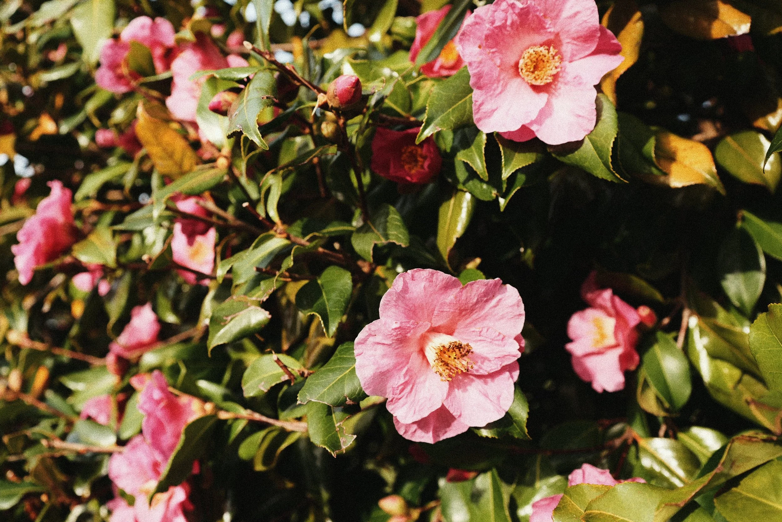
Check out some examples images with this new ‘look’ and read a little about the decisions I made when designing it below…


My starting point for creating this ‘look’ was choosing my LUTs. The first LUT I turned to was Ontario, which I designed to create a strong overall Kodak tone. I knew it would be too strong set to LUT Opacity 100%, and so I turned it down and started playing around with other LUTs on top. Finally I landed on my another of my warm, Kodak inspired LUTs BONBOA but turned the Opacity way down.
It took a while to settle on the correct LUT Opacity for each LUT but where this ‘look’ ended up was Ontario set to LUT Opacity 60% and BONBOA at 30% and I think the combination of these two works really well. You can download both of these LUTs using the buttons below…
The next setting to nail was the White Balance setting. Although Kodak Gold 200 is a daylight balance film stock, for this ‘look’ I knew I wanted it to have an Auto White Balance setting for flexibility. The White Balance tint was a little harder to get right. After a lot of playing around I finally landed on a simple but strong push in the White Balance to the warm side of A:8. It’s this setting that really puts the ‘gold’ into Kodak Gold.
To control the colours from both the LUTs and from the A:8 push in the White Balance, I've set the overall Saturation to -1 for this 'look' and then I've turned my Grain setting up to STD. which might be a little too much grain for some people. Maybe if you like a little bit less grain in your images, turn that down to LOW, but I think STD. really suits the kind of crunchy/contrasty look of Kodak Gold that I was going for here.
I wanted to have a bit more of a neutral tone curve to play with, so when designing this ‘look’ I chose a base Photo Style of Natural, and then added a Contrast setting of +2.5 and Shadow setting of -2.5 for that crunchy feel. I've turned Sharpness and Noise Reduction all the way down to -5 and then the final setting to change is your i.Dynamic Range to LOW to match Kodak Gold 200’s exposure latitude.
Just like the 35mm film stock that this LUMIX 'look' is based on, you'll probably want to shoot with it in the daylight. As with all of my film-stock inspired LUMIX ‘looks’, if you’re really chasing the film-look, I really recommend shooting with a manual focus/vintage lens for that extra flavour. This is one of those ‘looks’ that will work perfectly in summer, with a vintage lens. I’m really happy with how it turned out and I can’t wait to see other LUMIX shooters using it too!
Check out the setting below…
Kodak Gold 200
[by rossandhisjpegs]
Photo Style: Natural
Contrast: +2.5
Highlights: 0
Shadows: -2.5
Saturation: -1
Hue: 0
Grain: STD.
Color Noise: OFF
Sharpness: -5
NR: -5
i.Dynamic Range: LOW
White Balance: AWB (A:8)
LUT 1: Ontario by rossandhisjpegs
LUT 1 Opacity: 60%
LUT 2: BONBOA by rossandhisjpegs
LUT 2 Opacity: 30%
As featured in this video…
If you enjoyed this post, why not drop something in the Tip Jar below to say thanks. It would be massively appreciated!