Fujifilm Pro 400H
This new ‘look’ I’ve created for LUMIX cameras, isn’t really new at all. It’s one I’ve been working on and playing with for quite a while to be honest. I first started designing it about 8 months before the time of writing this, back in October 2025 but I’ve sat on it for a while waiting for the right time to share, and now… that has come!
This new ‘look’ is based on the legendary film stock Fujifilm Pro 400H. Fujifilm’s colours are obviously iconic, and there’s maybe no film stock released by Fuji as iconic as this one. Check out some straight-out-of-camera JPEGs shot over the last 8 months with my version of Pro 400H…
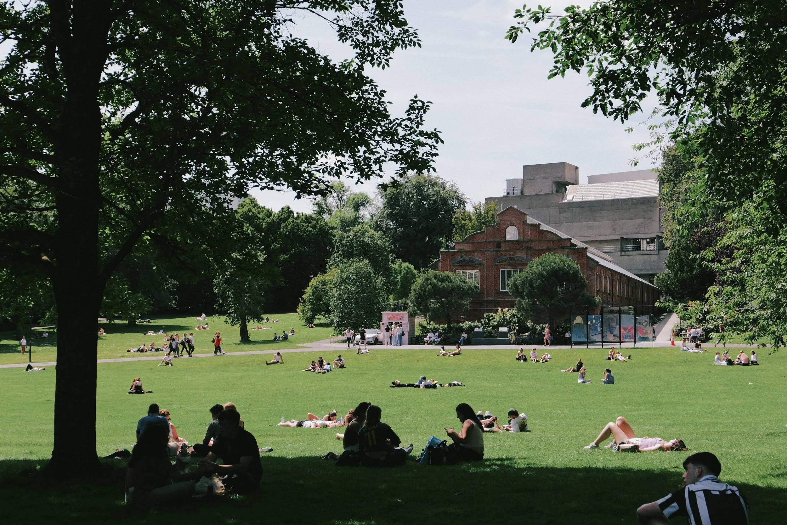
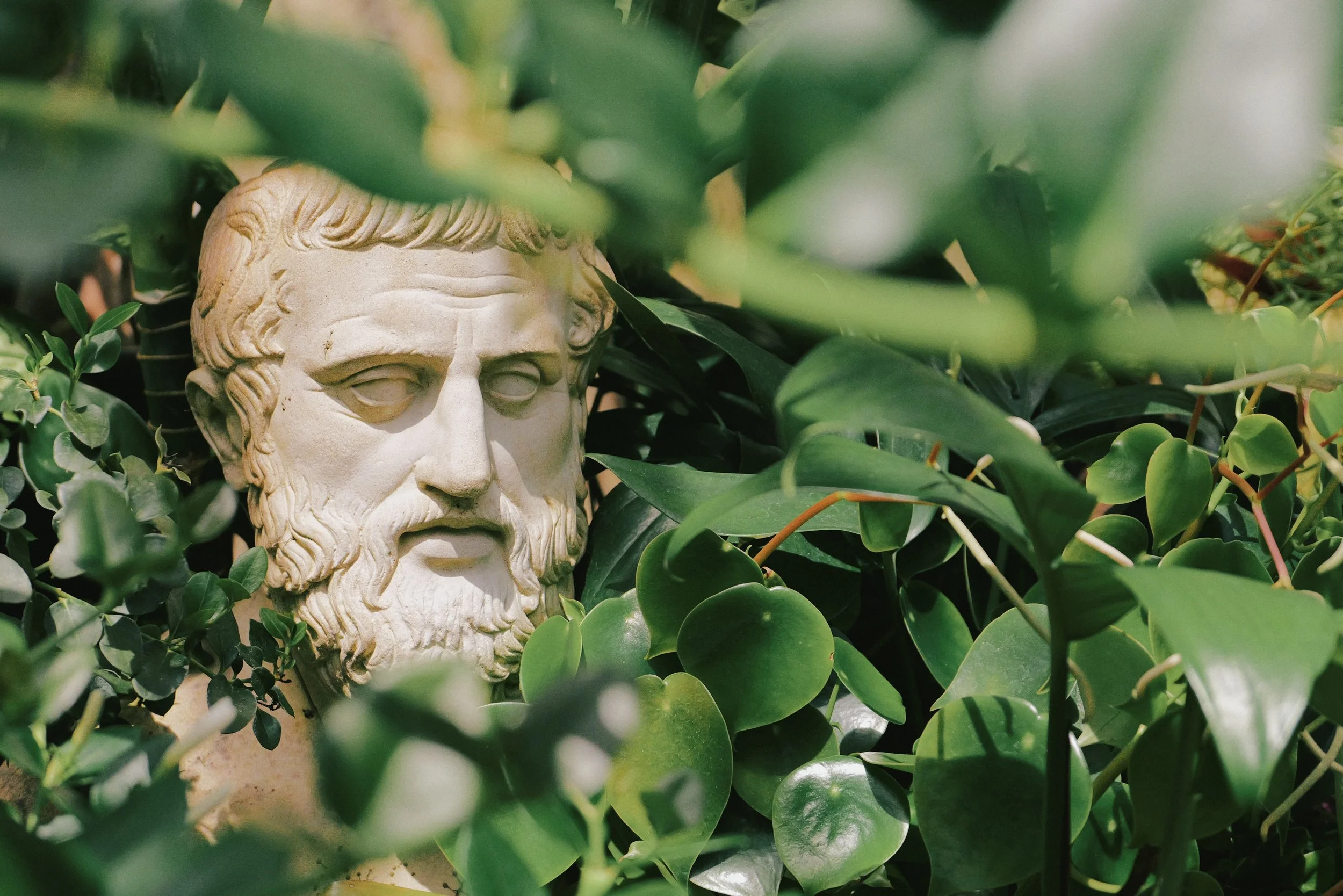
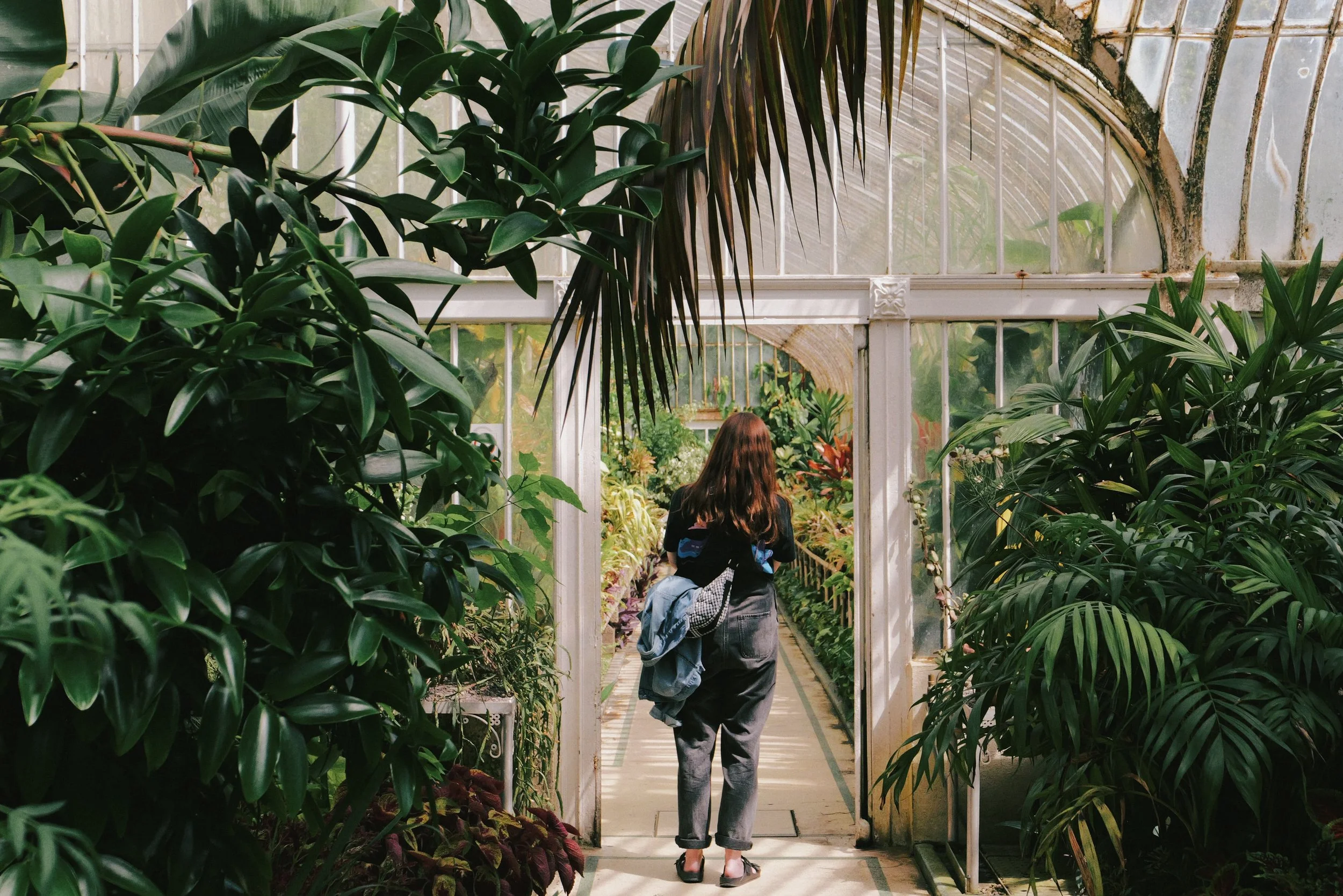
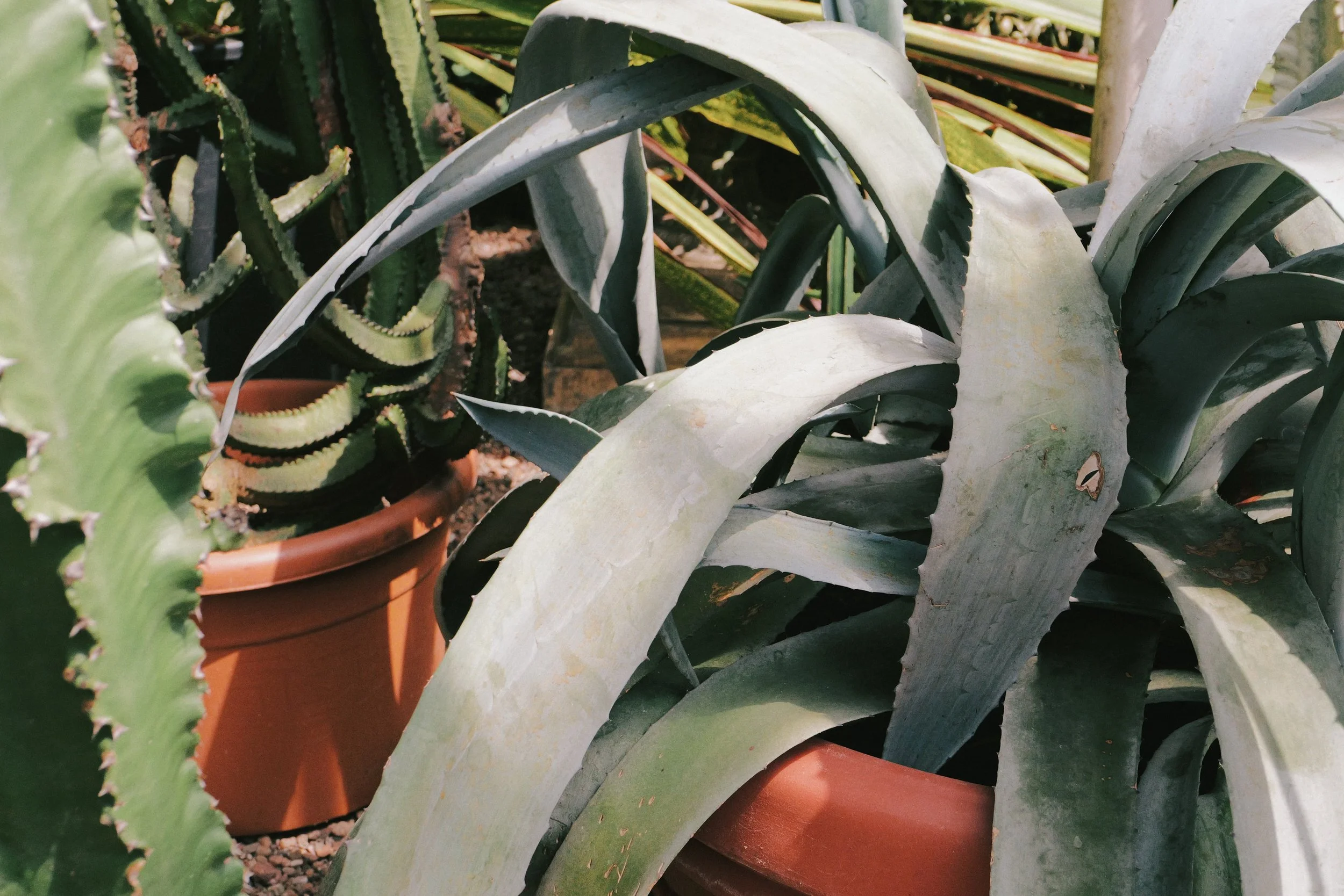
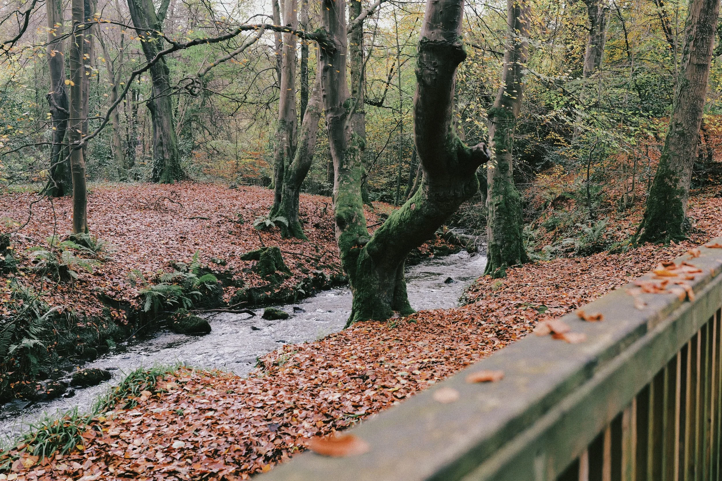
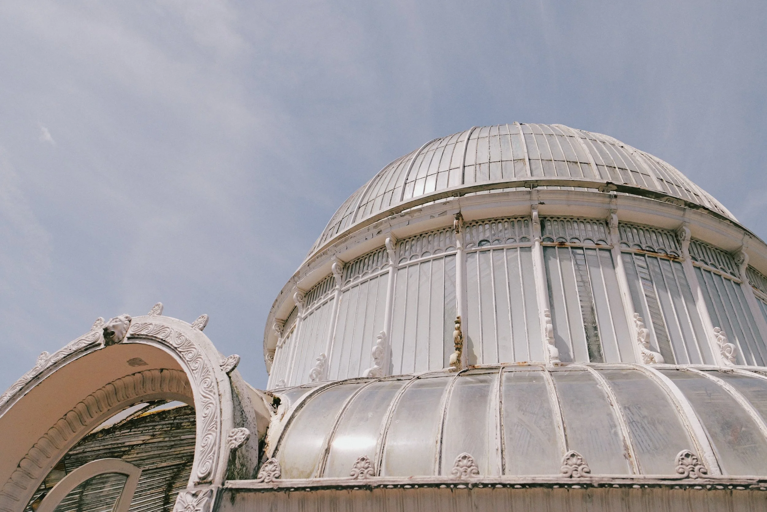
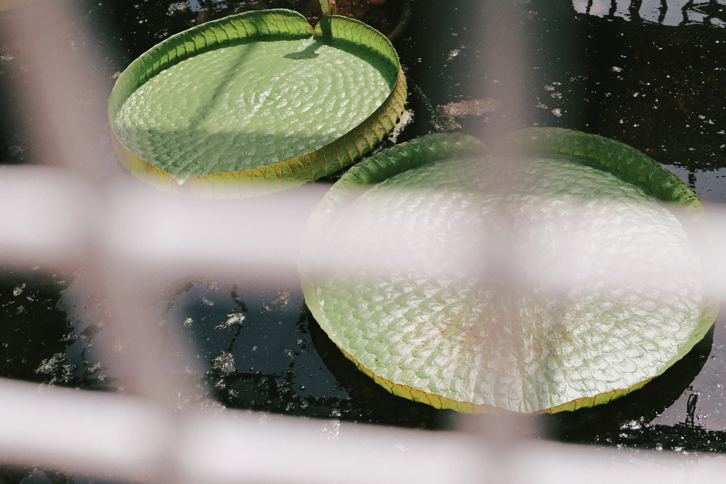
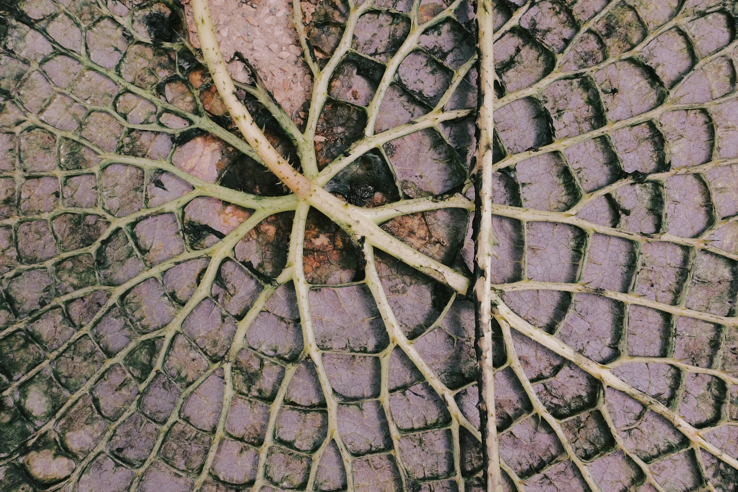
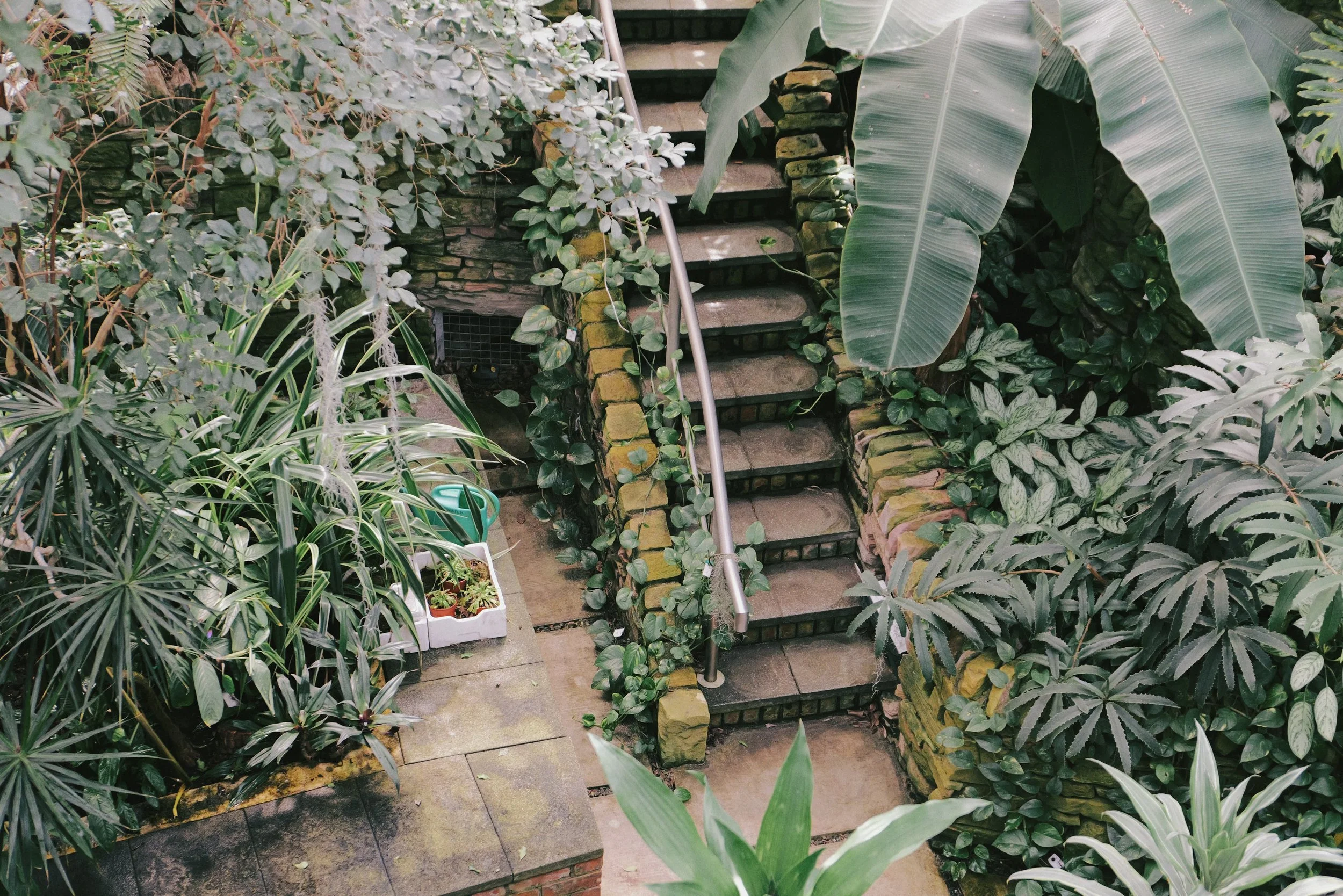
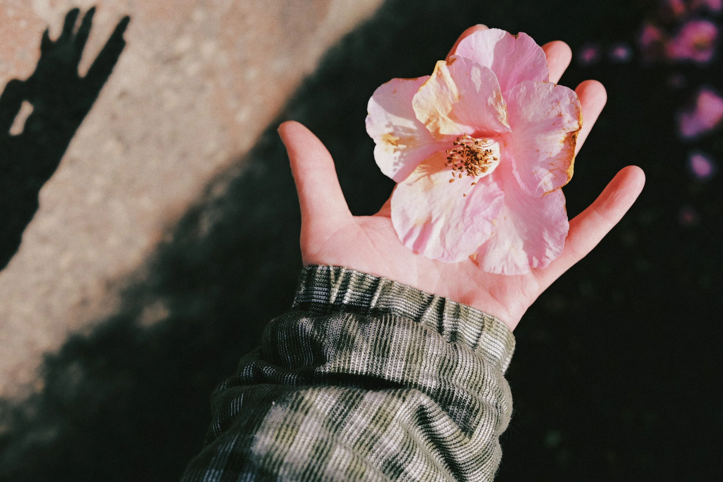

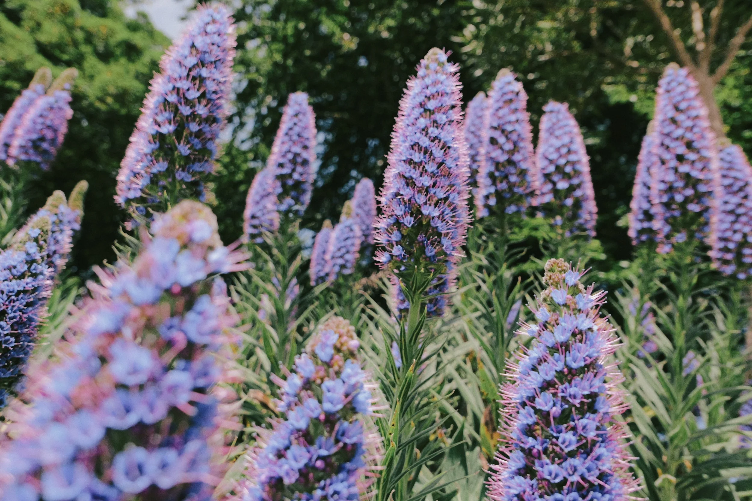
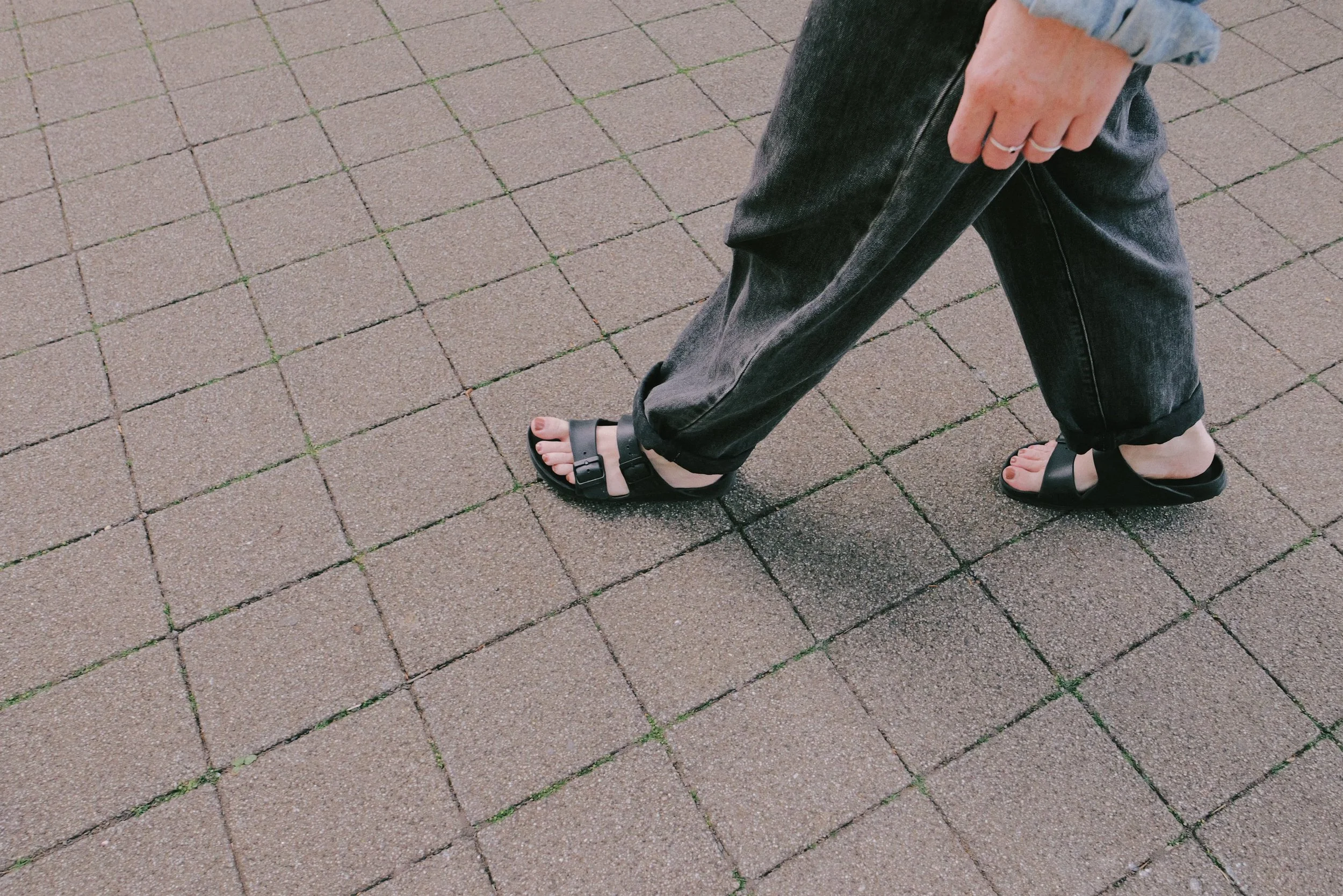

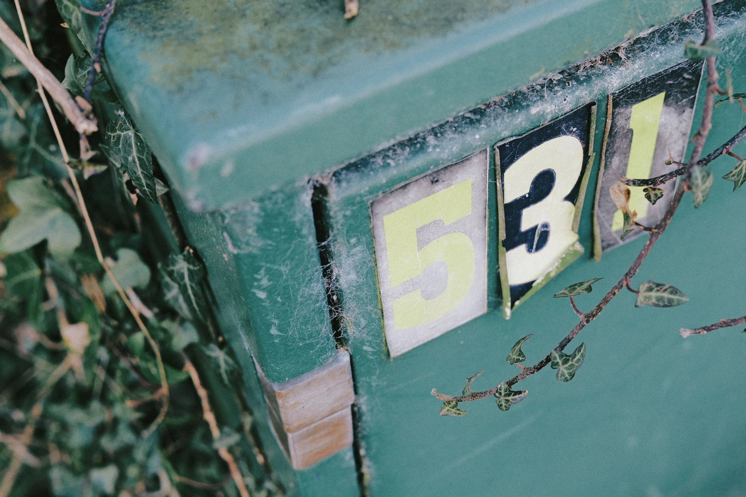
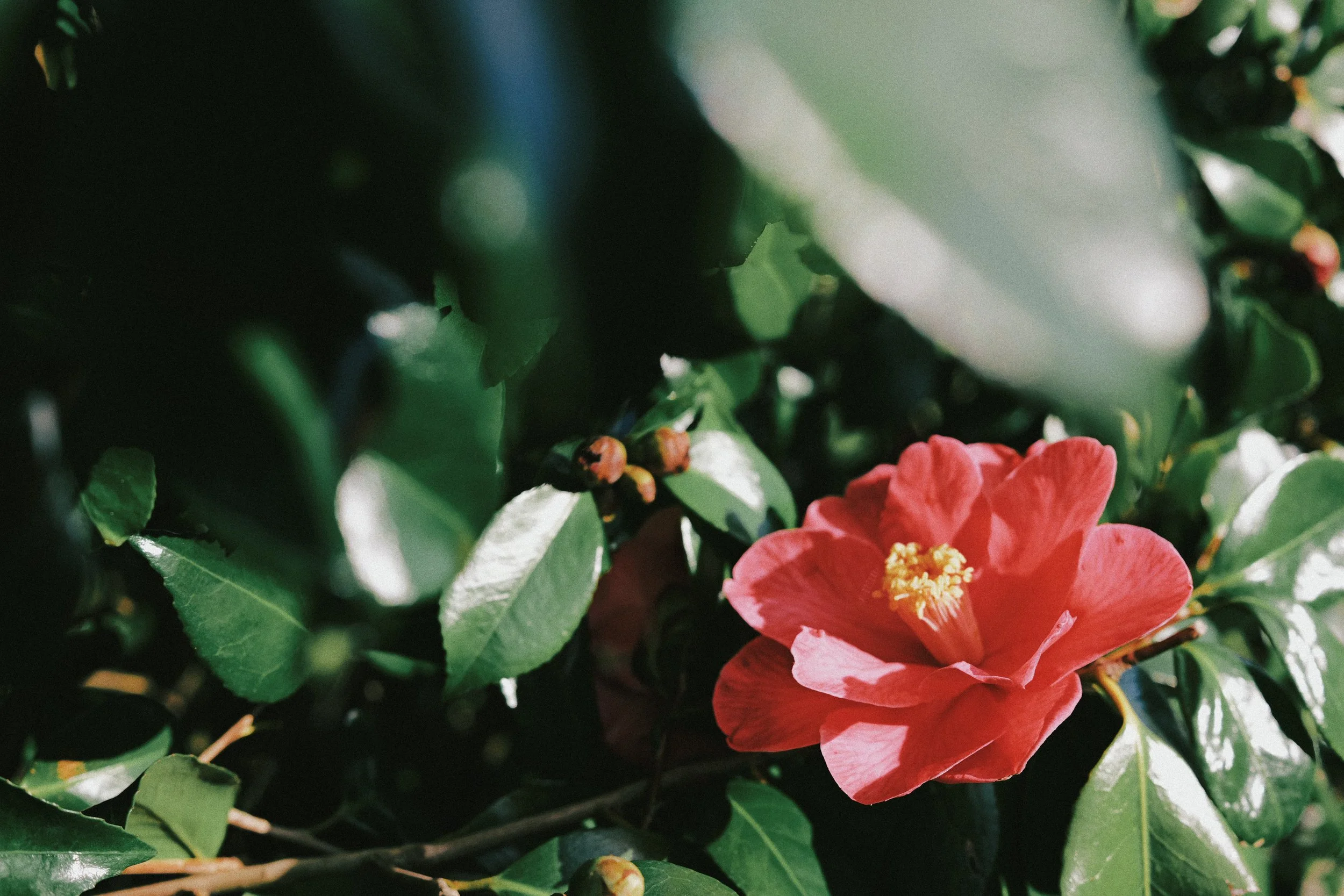
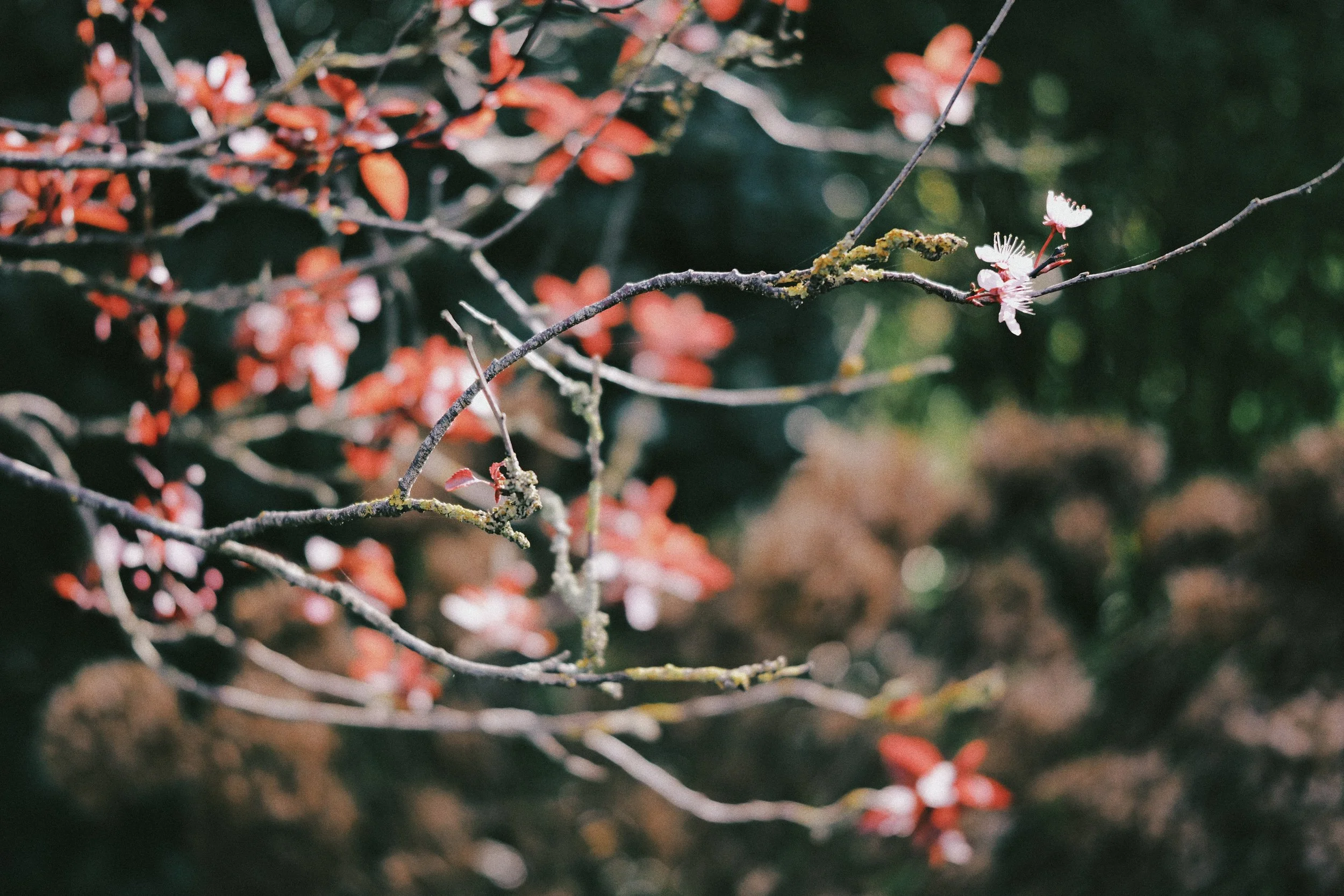
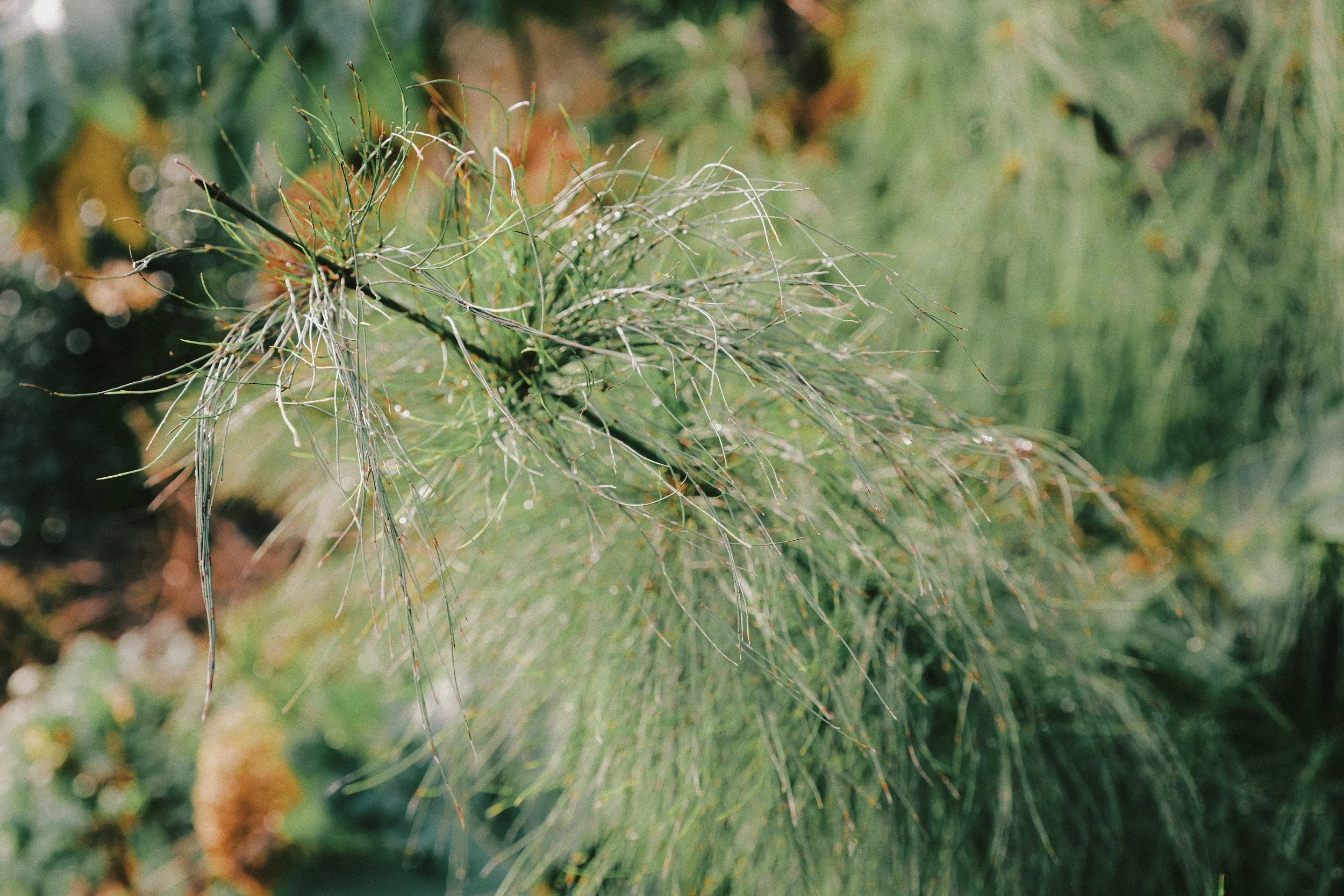
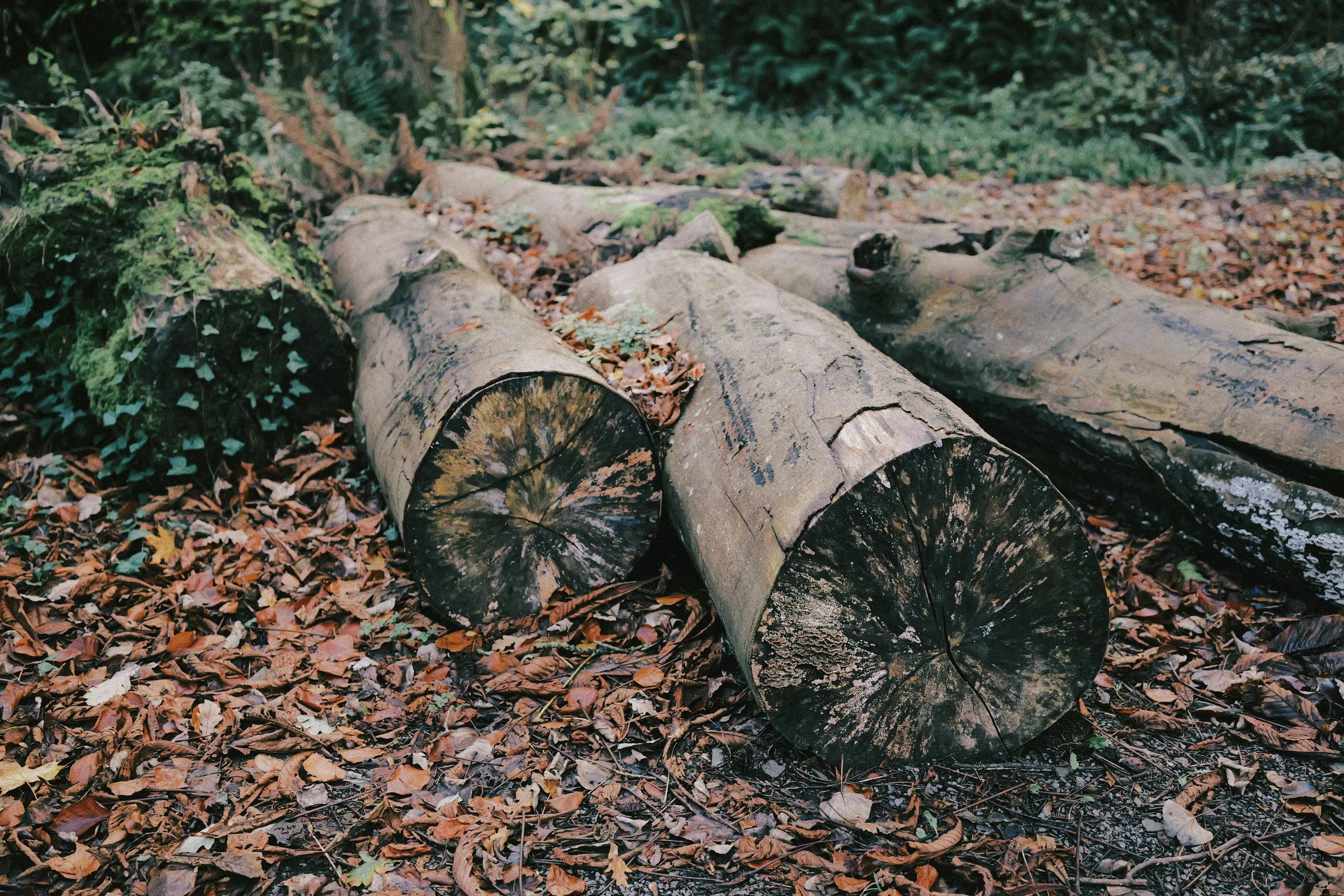
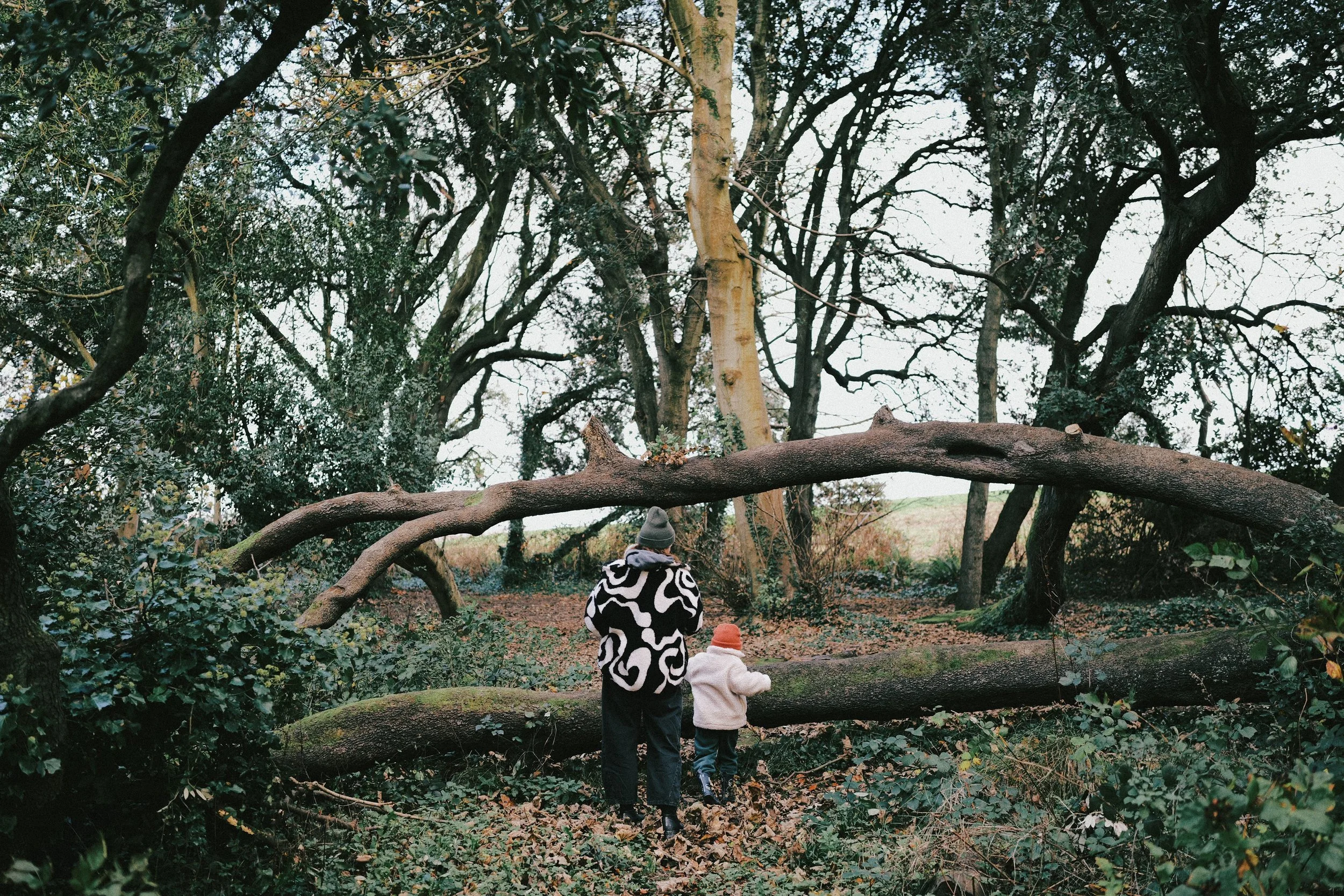
Fujifilm Pro 400H is known for its soft and pastel colour palette with an emphasis on greens and magentas, and so my starting point for this ‘look’ was combining of my two Fujifilm inspired LUTs. The magic combination I landed on was Kitaura at LUT Opacity 40% and Hibiscus at LUT Opacity 70%. You can download both of these LUTs below.
I gave this ‘look’ a base Photo Style of Standard with a few other tone tweaks in the Contrast, Shadows and Highlights settings. Fujifilm Pro 400H is quite a sharp film and has fine grain so I’ve set the Sharpness for my look to -3 and Grain setting to LOW to match that.
Something this iconic film stock is maybe best known for is its exceptional exposure latitude and so for shooting JPEGs with my LUMIX version, I’ve decided to set my i.Dynamic Range to STD. (The reason I haven’t chosen HIGH is because I think pushing the i.Dynamic Range to HIGH can sometimes push the shadows up too much.) Setting it to STD. and turning down the Highlight setting, for this ‘look’ I have it set to -2, means you don’t need to worry about blowing the highlights. In fact over-exposing a little with this ‘look’ I think can produce really lovely images that help get you that bit closer to the look of the film stock it’s based on.
Although Fujifilm Pro 400H is balanced for daylight, I’ve set my White Balance to Auto with a push of 3 towards both Amber and Magenta. Then finally to give the ‘look’ the correct pastel tone, I’ve set the Saturation setting to -2 to soften out those colours.
Check out all of the settings you’ll need to recreate this ‘look’ for your own LUMIX JPEGs below…
Fujifilm Pro 400H
[by rossandhisjpegs]
Photo Style: Standard
Contrast: -1
Highlights: -2
Shadows: -3
Saturation: -2
Hue: 0
Grain: LOW
Color Noise: Off
Sharpness: -3
NR: -5
i.Dynamic Range: STD.
White Balance: AWB (A:3 M:3)
LUT 1: Kitaura by rossandhisjpegs
LUT 1 Opacity: 40%
LUT 2: Hibiscus by rossandhisjpegs
LUT 2 Opacity: 70%
If you enjoyed this post, why not drop something in the Tip Jar below to say thanks. It would be massively appreciated!